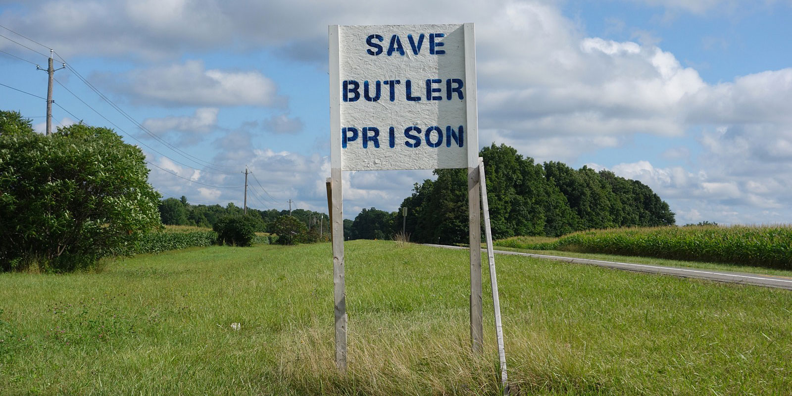
North Country humor. Contributed by Pete and Shelley.
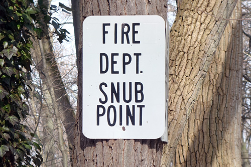
Good luck getting a response beyond this point.
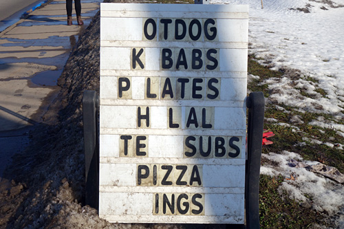
Almost like the Jumble puzzles.
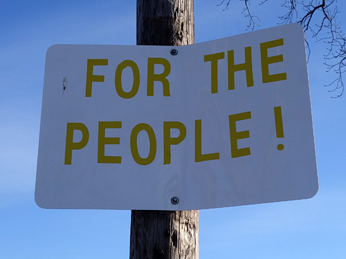
This sign could work anywhere.
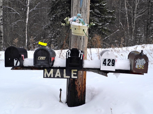
Male boxes in the Adirondacks.
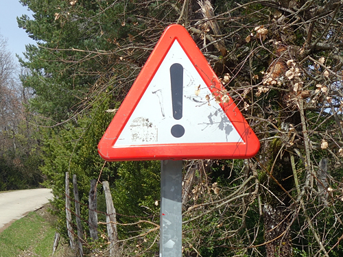
What?
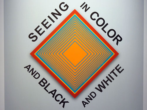
Just “Seeing” would cover it.
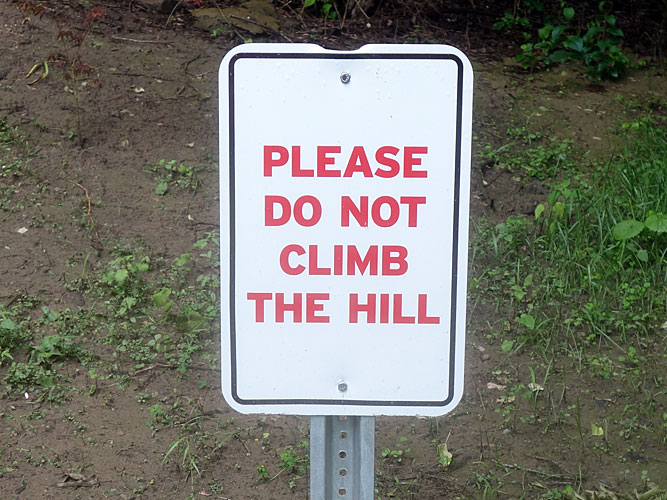
The opposite of “Climb Every Mountain.”
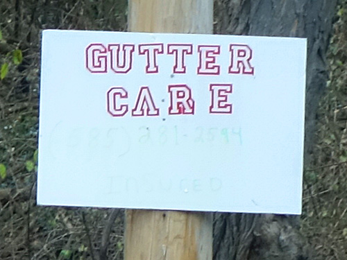
If this company takes as much care hanging gutters as they do with their signage I might consider hiring them.
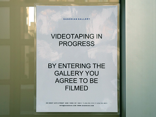
Am I agreeing to being videotaped or filmed?
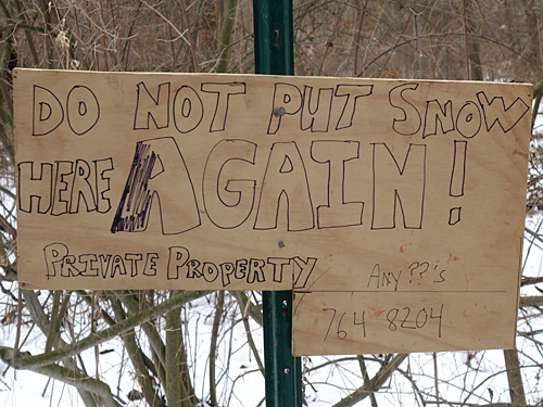
Addressed to he who makes it snow.

Where do you go to see the full list?
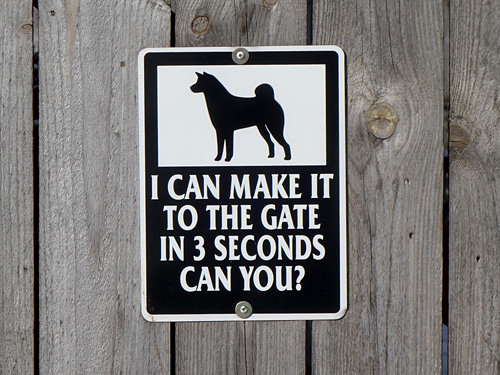
I think I can.
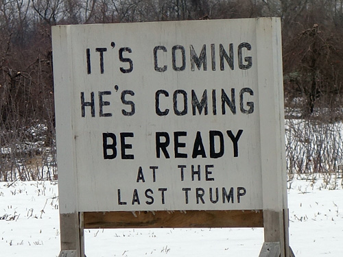
“At the Last Trump” or “At Last The Trump.”
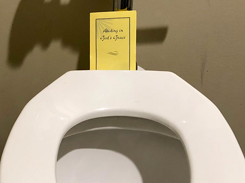
Prayer time on the thrown.
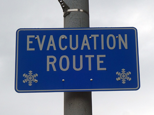
When everything is white but this sign.
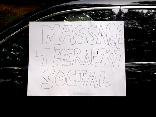
This is exactly what I would expect a Massage Therapist Social sign to look like.
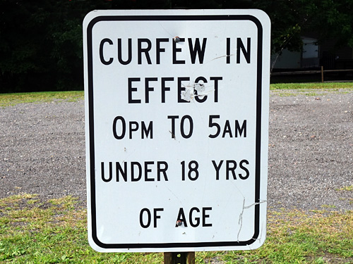
Hard to disobey.
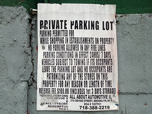
A lot of important stuff to say so all caps, big point size, a little bit of compression.
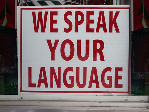
Hope you can read our English sign.
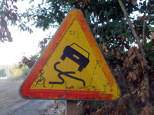
How do you suppose those tires crossed one another?
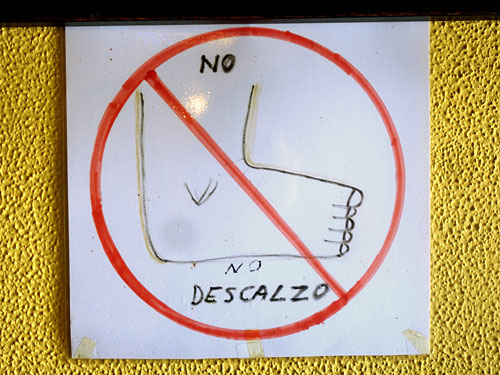
No stinky foot oder please.
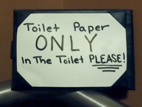
Wait a minute!
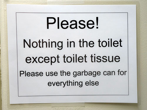
Just imagine how stinky that garbage can is.
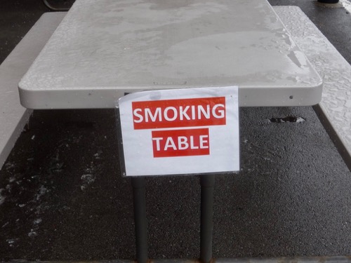
Looks like any other table but it smokes.
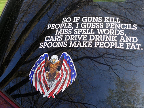
Miss Spell?
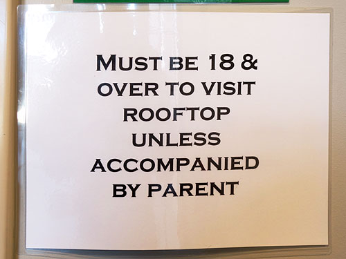
It is impossible to be both 18 and over.
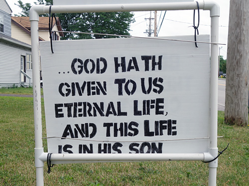
I like how the hand-cut stencil look fell apart.
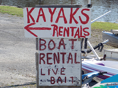
Pluralizing just one of these first two words would have done the trick.
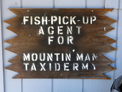
It would be a pleasure to meet the Mountain Man.
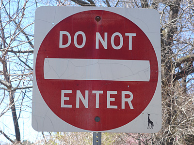
The tiny giraffe makes this sign look huge.
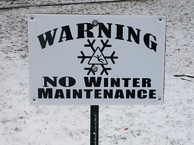
It’s true. No two snowflakes look alike.
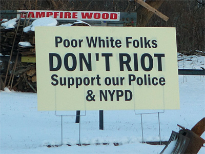
Racist head scratcher.
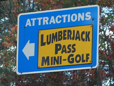
I brake for lumberjack miniature golf.
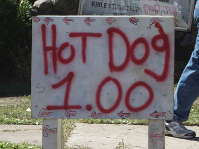
Some stickler felt the need to add the dollar sign to this beauty.
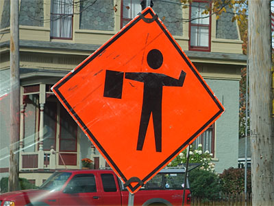
This fellow has already lost a hand so please watch out for him.
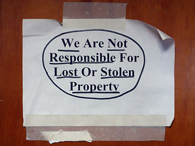
The judicious use of underscore with the circle really drives this message home.
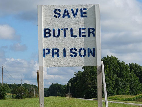
Aww. I loved that place.
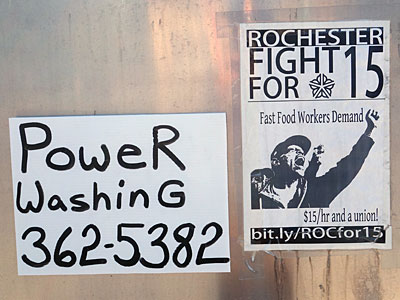
Black Power Washing.
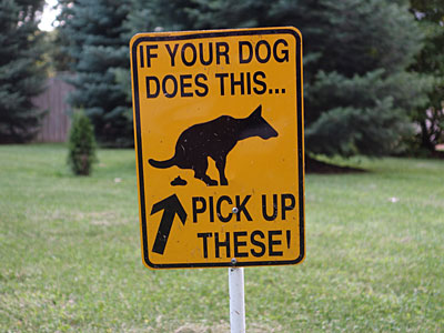
My dog would never do that.
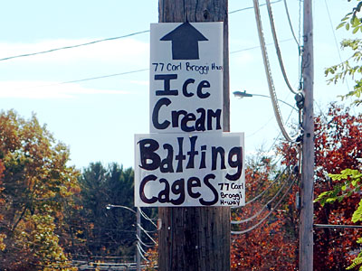
Could get pretty messy.
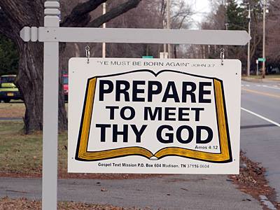
You meet Thy God. I’ll meet my god.
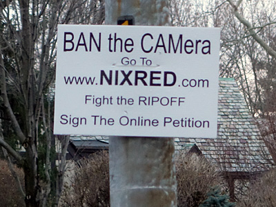
Four commands on one sign is pushing it.
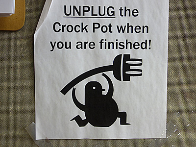
And do it with pizazz!
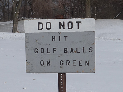
That makes this game a lot easier.
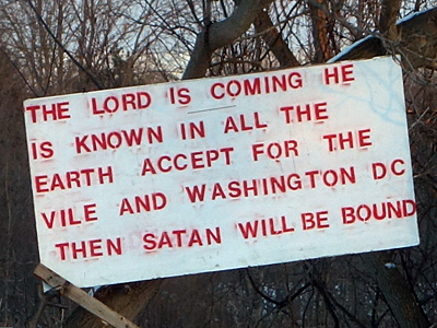
It seems silly to quibble over the use of the word “accept” in this sign.
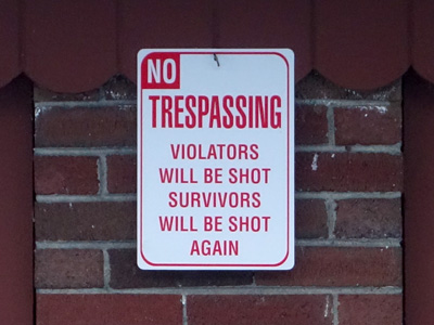
Trespassing used to be kid’s stuff.
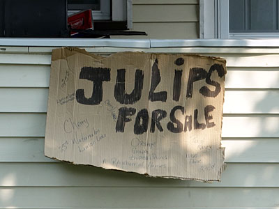
Julips? I had to look this up. I could not find an entry for “julips.”
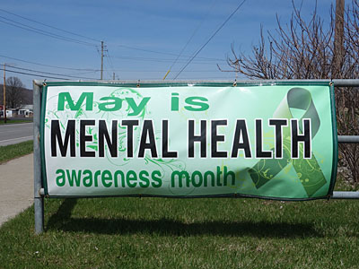
The cruelest month.
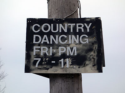
You know, like you have a load in your pants.
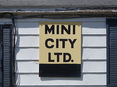
Everything is limited in Mini City.
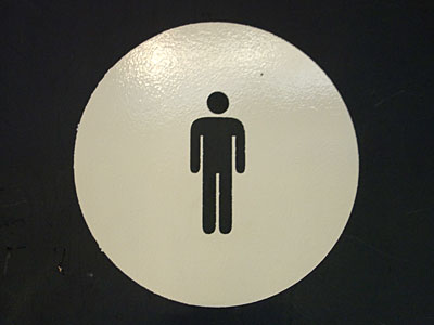
Warning sign in the animal kingdom.
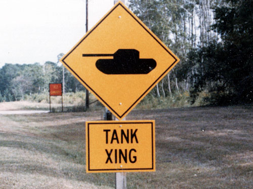
Serious signage.
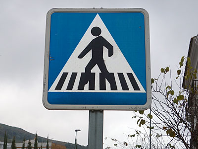
Sidewalk crossing in the key of C. Black keys only.
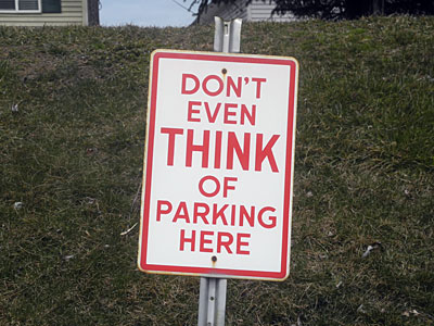
Too late.
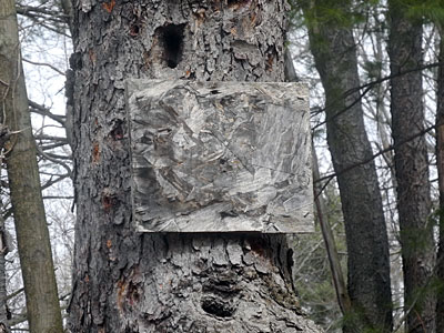
A perfectly camouflaged sign!
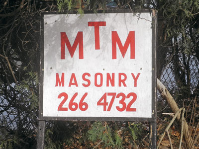
I love the religious overtones in the levitating “T” and the way the tight kearning on the numbers leaves plenty of room for the imaginary dash.
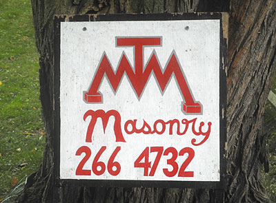
They pulled out all the stops with this updated version of their logo anchoring the double “M” footings with concrete blocks.
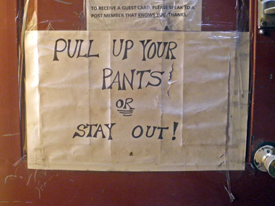
This is a sophisticated place.
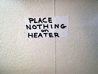
It’s a Zen thing.
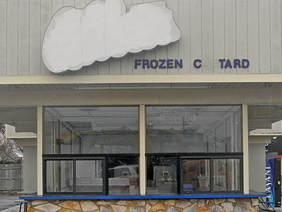
Go US!
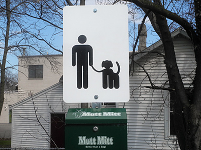
Mitt Romney and his dog, the one he put on the top of the car.
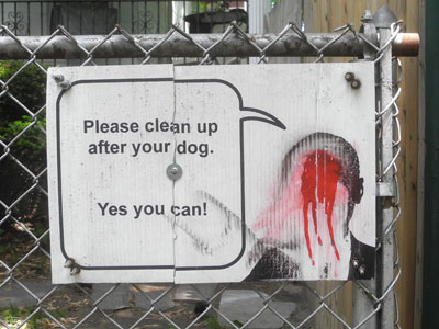
This sign maker toyed with the concept of encouragement but it seems to have backfired on him
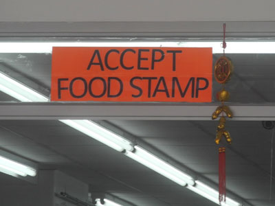
One at a time.
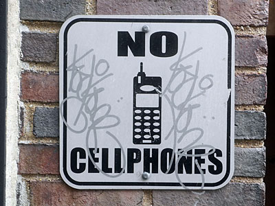
New York’s Luddite section.
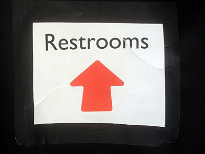
Cute little restroom.
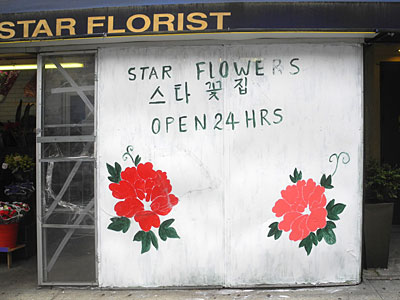
I can see there being a real demand for a florist in the middle of the night.
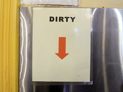
Where all at the dirty things are.
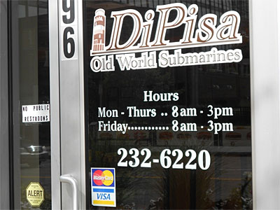
Note the special Friday hours.
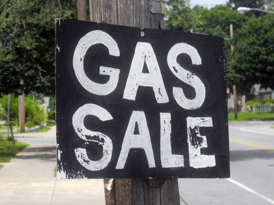
Like my grandfather used to say, “Everything is always on sale or you wouldn’t be able to buy it.” Most gas stations are owned by big oil conglomerates but this no name station is having a sale on gas and their sign caught my eye.
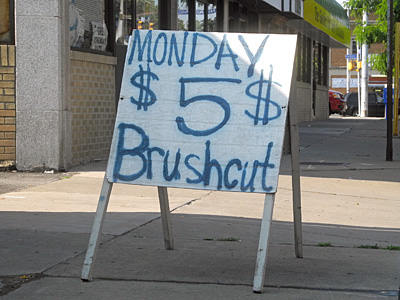
I was imagining a five dollar brush cut as I was taking this photo but the owner came out and demanded that I delete the photo. Apparently licensed barbers in New York State have a minimum price they cannot undercut.
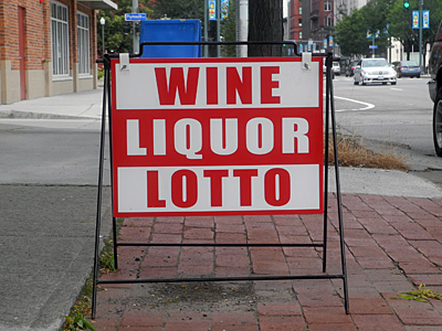
This sidewalk sign dances with excitement. Barbara Kruger, eat your heart out.
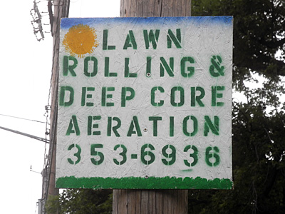
Deep Core Aeration! Love the stencil letters, healthy kerning, yellow sun, blue sky and deep green lawn.
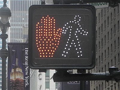
Which is it?
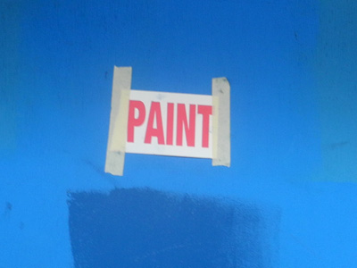
At first it reads like a noun but then the command form of the verb kicks in.
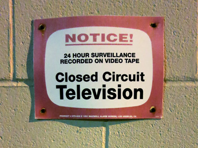
Closed circuit television! Video tape! What is this, 1984?
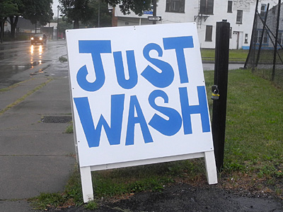
Exhuberant lettering. No up-sell. Just wash.
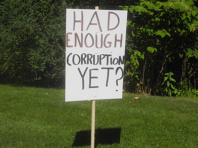
I could handle a little more.
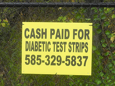
American health care system.
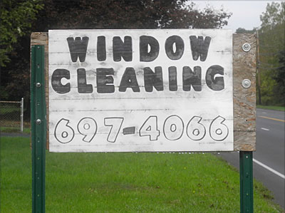
What I like most about this sign is the way it is constructed with one pole on each side of the sign.
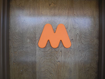
Coincidentally PopWars and Dunkin Doughnuts share the same pink and orange colors. The “m” above is on their men’s room door and the same letter, turned upside down and painted pink, is on the women’s room door.
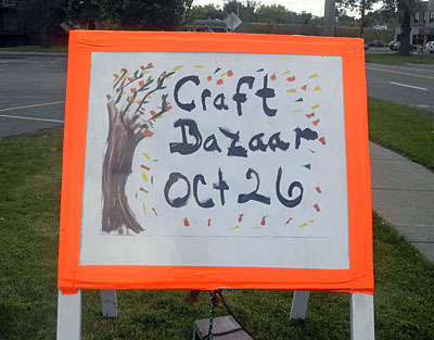
Love the tree.
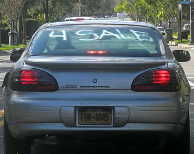
Never seen “for sale” done this way.
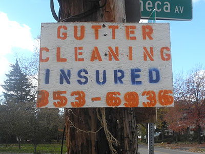
The phone number is easier to read when you’re driving
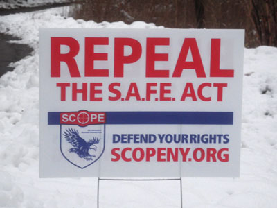
What this sign really means is “Don’t even think about stepping foot on our property. We’re armed to the teeth.”
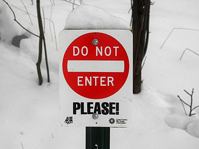
I find I am less likely to obey a sign when they use the word “please.”
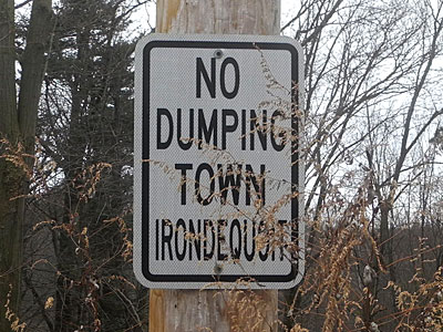
Who needs prepositions?
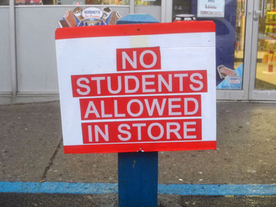
How about law students? This doesn’t seem constitutional.
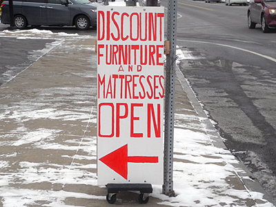
When I think of mattresses I usually think big and cushy but this sign is so slight. And it’s mounted on wheels!
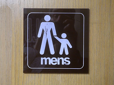
The seldom used plural of men
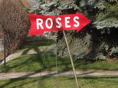
We have roses too but we don’t have a sign like this.
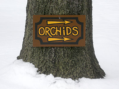
One arrow just wouldn’t have done the job.
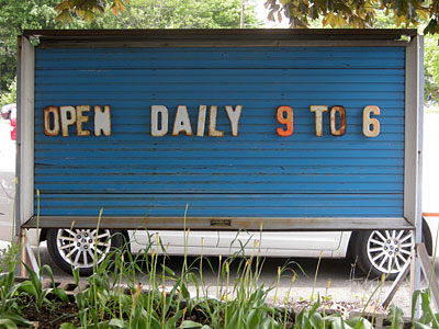
I love the way the rust is creeping onto these old metal letters at Case’s Garden Store.
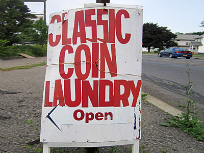
Small time money laundry.
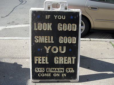
If you don’t, just walk on by.
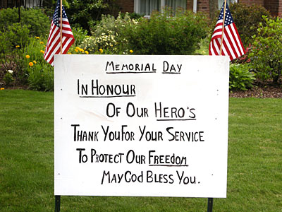
Nice sense of space in this sign. Interesting to see the English spelling of “Honor” and the possessive of “Hero.”
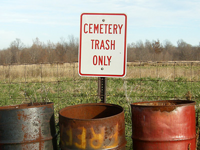
You gotta wonder how much trash a cemetery generates
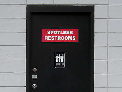
Spotless because the door is locked.
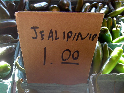
A tough word to spell but a good price.
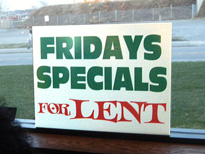
I usually associate Lent with sacrifice and giving things up.
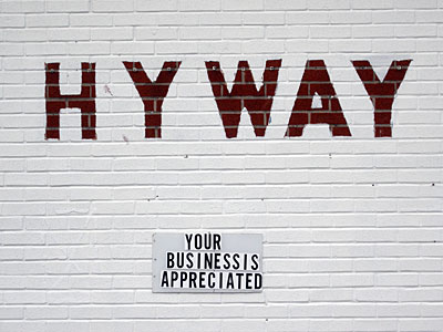
I love this modern spelling of highway but it looks like the kerning tables have gone awry

I love the way you pronounce “soon”
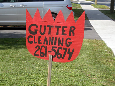
The shape of this sign is the long view of your gutter. The spikes illustrate debris being ejected.
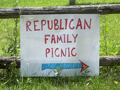
Guns, God and Gaiety.
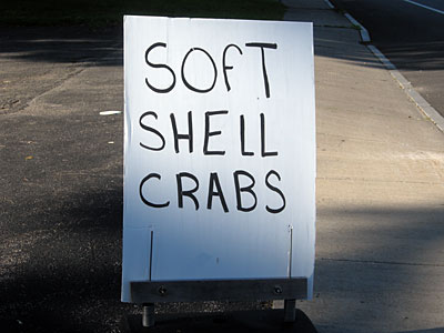
This is soft shell crab typography if I have ever seen it.
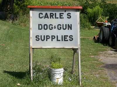
We carry two products. Dog food and ammo.
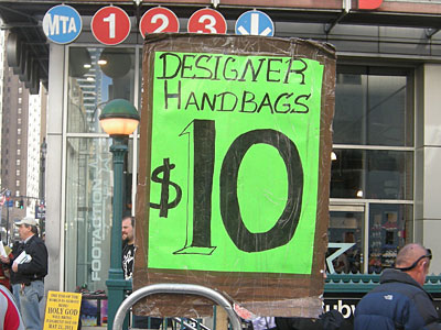
This is a great price for designer handbags and I love the 3D action on that number one.
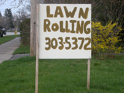
Yes, I would like to have my lawn rolled.
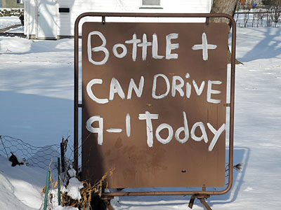
This brown and white sign looks fantastic in the snow. And I love the tubular, rounded corner, framework.
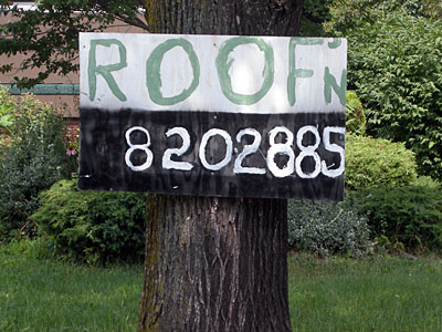
Roofing is elitist. Roof”n is not.
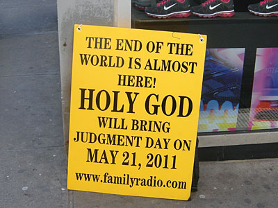
My family was tuned in to Family Radio on that day and we are extremely disappointed.
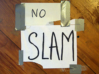
Appropriately designed in the visual language of slam dancers.
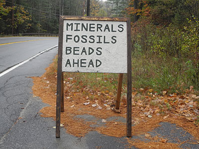
Stuff the big box stores won’t carry.
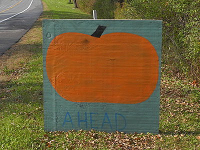
A good sign uses as few words as possible

I love it when people use plumbing gear to make a sign. I like the flush left, initial cap arrangement and the way the sign is hung off center. I like how the “r” in word “For” teeters on the stem of the “l” in “sale.” Most of all I love the way the lettering sits on the bottom edge of the sign.
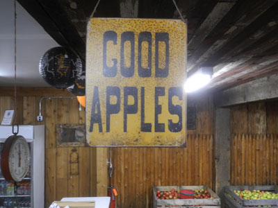
No hype, no branding, just the gosh honest truth.
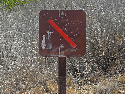
Just don’t.
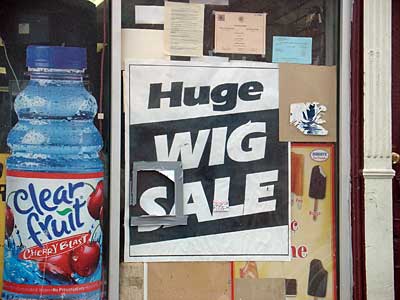
For big heads.
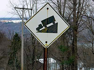
Look out below!
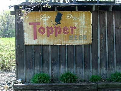
My uncle worked for Topper, a long time ago. This sign is still working.
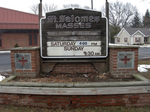
Let’s face it. After a many centuries the Catholic Church is looking a little shabby.
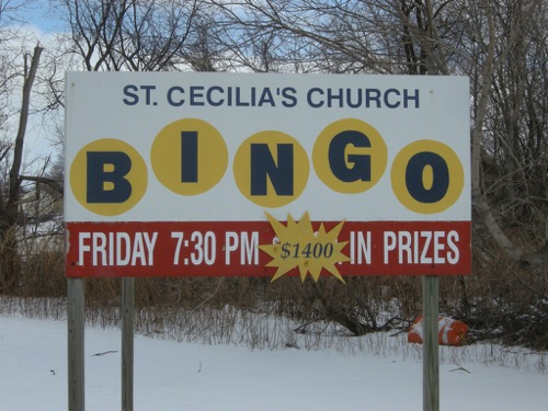
Bingo! Looks just like it sounds.
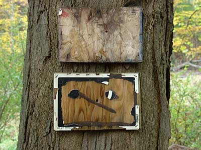
Most signs are tediously literal.
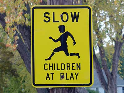
The kid looks pretty quick.
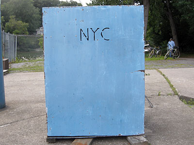
No, not that NYC. This elegant sign is for Rochester’s Newport Yacht Club.
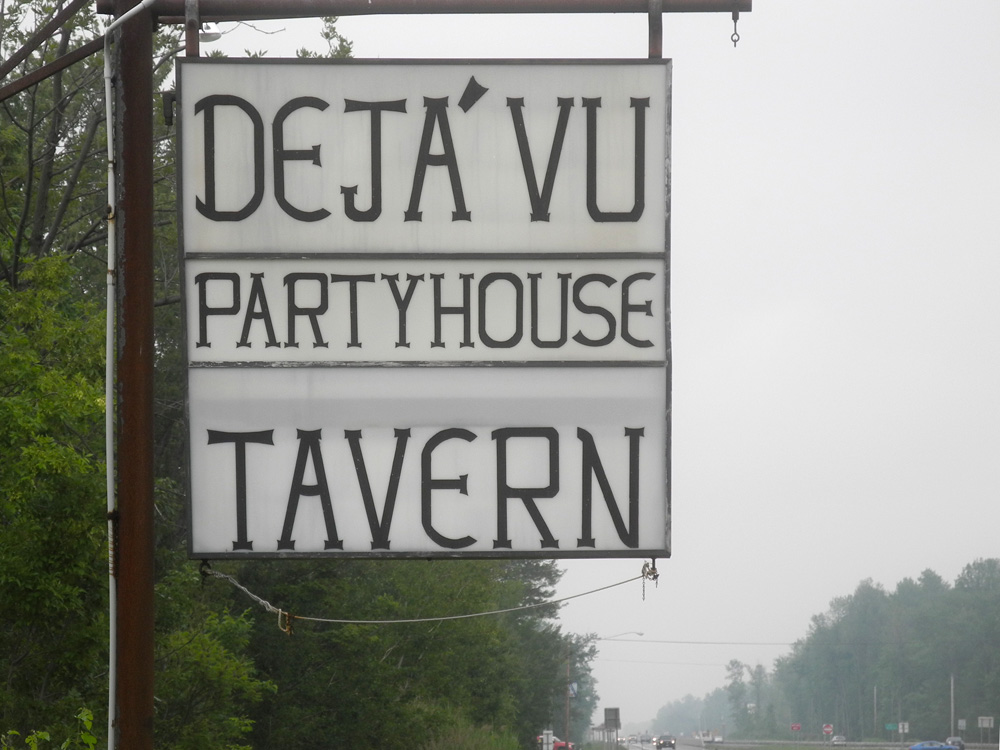
I don’t get a good feeling from this Party House sign.
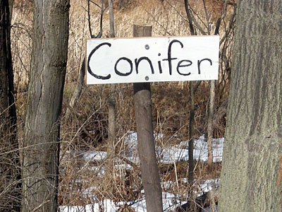
This town would be a lot more interesting if all the residents made their own street signs.
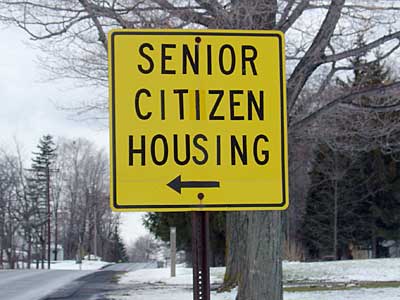
Out of sight, out of mind.
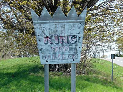
I love the royal shape of this sign. Long live the King!
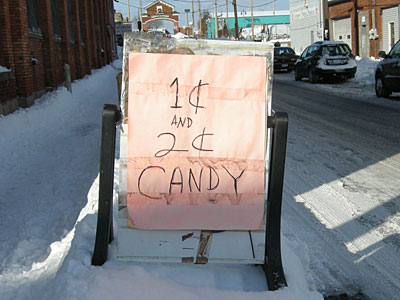
This is why the penny is still in circulation.
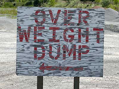
Draconian new health care remedy.

Imagine that. One of the Great Lakes is open.
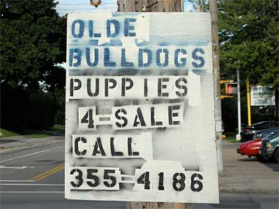
Looks like a ransom note.
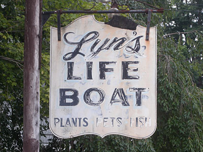
A scaled down version of Noah’s Ark.
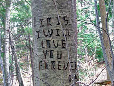
I love you so much I’m going to deface this beautiful tree.
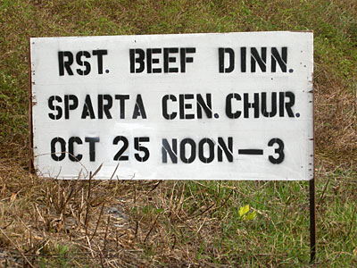
The abbreviations make this sign especially intriguing.
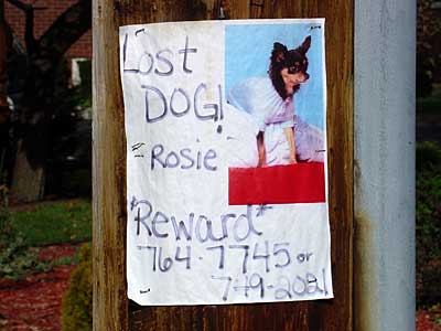
The dog probably ran away. Look at that outfit!
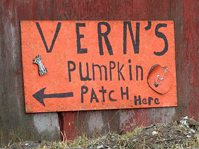
Vern did the lettering himself
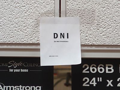
OK, I will not inventory. I was just shopping for ceiling tiles.
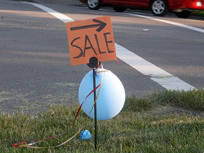
The balloons get your attention but there is a lot left to the imagination with this little sign.
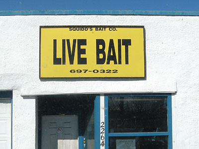
This sign looks like a car license plate.
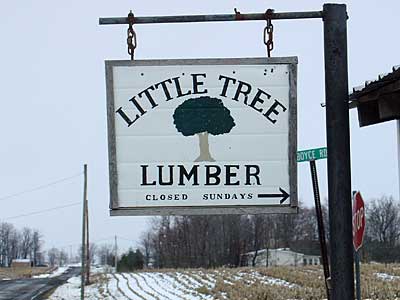
For small projects.
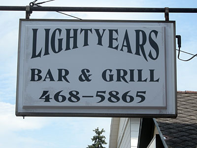
I could see spending some time in a place like this.
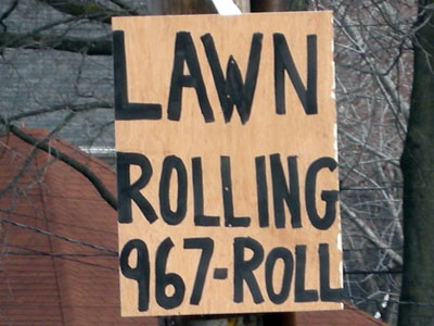
967-ROLL. This could be my favorite sign, ever.
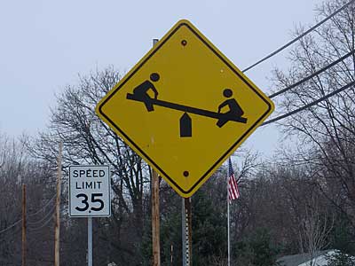
I can’t remember the last time I saw kids playing on a teeter totter but I will keep my eye out for them.
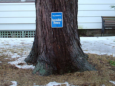
You could put this sign almost anywhere and get away with it
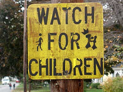
Some strange looking children.
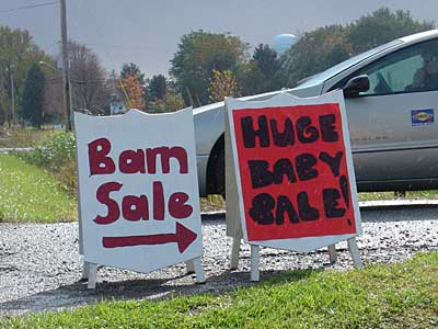
Just how big is that baby?
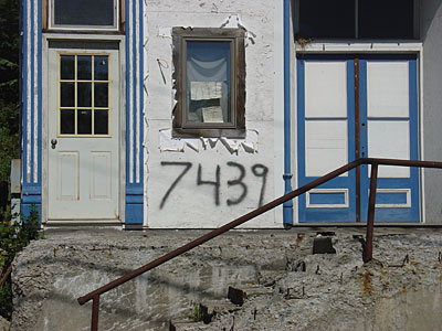
This house number borders on vandalism.
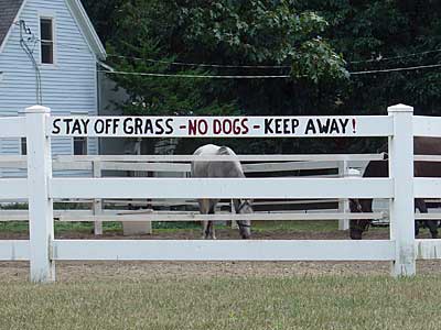
Anything else?
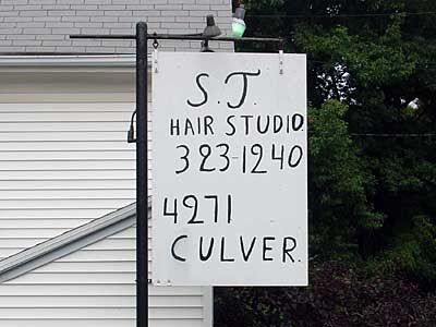
I could see leaving here with a beehive.
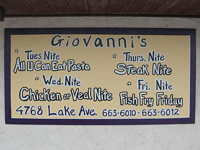
I feel as though I am flying through space as I read this sign. Maybe it’s the stars.
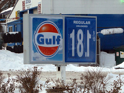
They misplaced the decimal point and put the number one on backward.
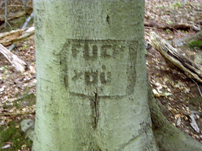
Nature can be cruel
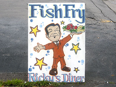
If this little guy serves me I’m in.
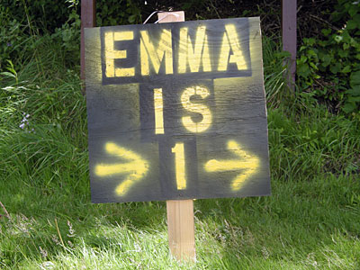
I guess they didn’t have a stencil for the arrows.
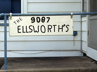
A simple number on the house was not enough for the Ellsworths but they probably don’t need the apostrophe.
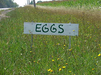
Yes, I would love some eggs.
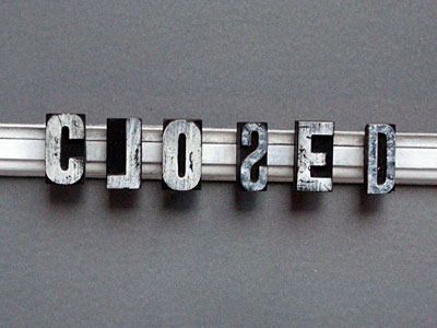
A seriously playful letterpress sign.
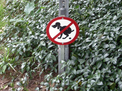
This little sign is almost as nasty as the infraction.
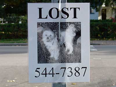
Rorschach dog poster.
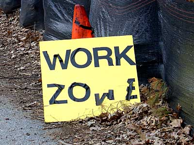
Looks like the workers took a drug break.
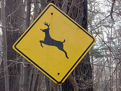
A red dot from Office Depot turned this deer into Rudolph.
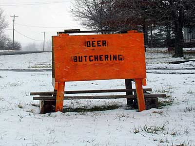
A particularly grizzly attraction.
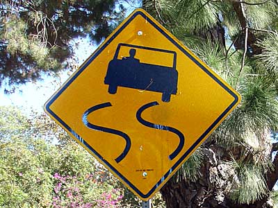
A wide wheel base helps navigate these curves.
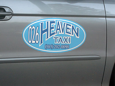
For that last ride.
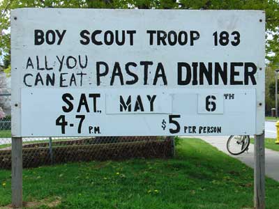
A different troop member is responsible for each entry on this sign.
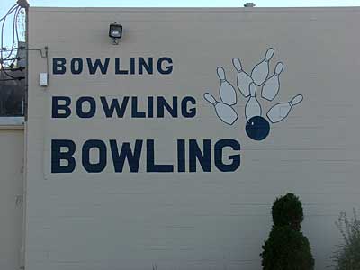
I can almost hear the pins drop.
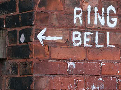
And plug your ears.
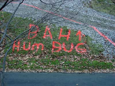
Two neighbors fought a long court battle over who owned the area below the orange, spray-painted line. The neighbor above the line lost.
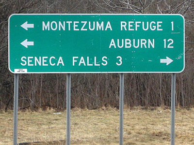
Did they have to justify the type on this sign? We wanted to go to Auburn and almost turned right.
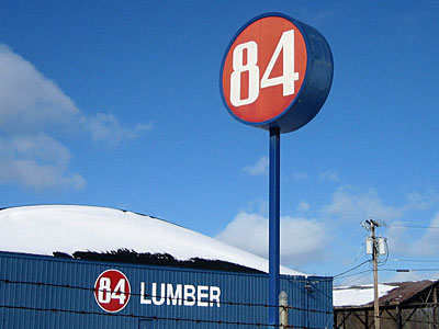
Pick a number and claim it as your company name.
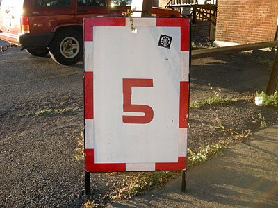
We usually look for free parking but I might give this guy a five just because his sign is so nice.
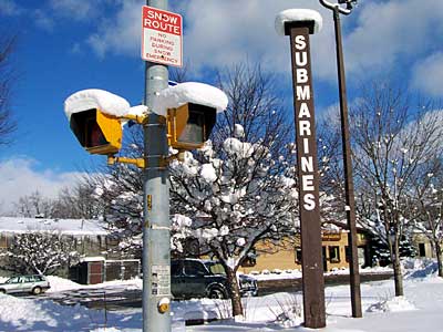
I love the periscope sign in front of Ceaser’s Sub Shop.
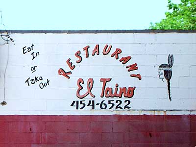
Hand painted by the owner.
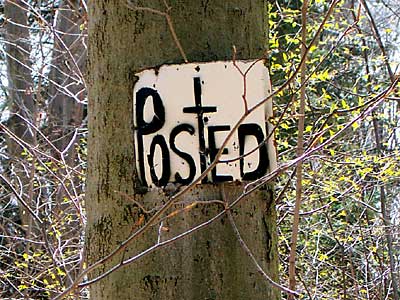
Posted with religious overtones.
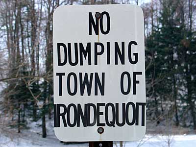
With some judicious kerning they squeezed the name of the town in this vertical format.
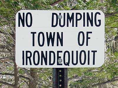
This wide orientation leaves plenty of space for “Irondequoit” and enough room to experiment with word spacing.
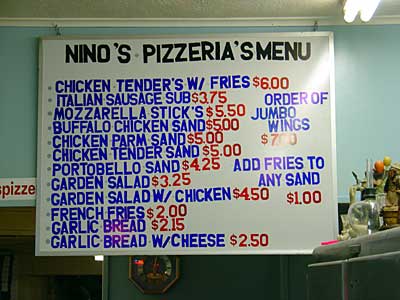
Nino’s Pizza is so good it is a wonder they offer anything other than pizza.
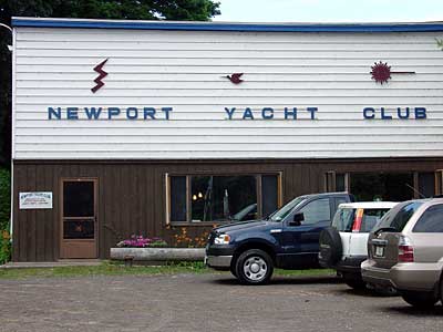
The Newport Yacht Club on Irondequoit Bay has a sensational flair for graphic design.
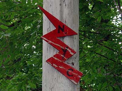
Lightning and sailing, an unlikely combination for the Newport Yacht Club motif.
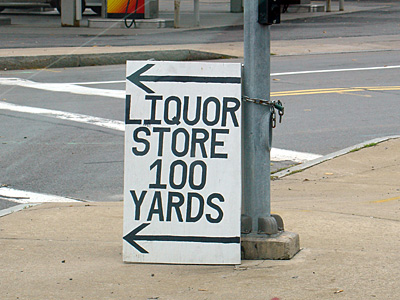
The lettering and arrows on this sign in Geneva New York were both done with electrical tape.
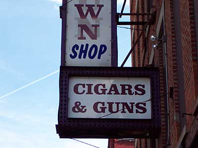
A match made in heaven.
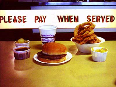
You need 3D glasses to really appreciate this sign.
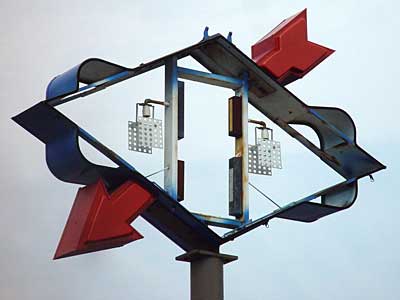
The Sunoco logo is gone but the brand still reads.
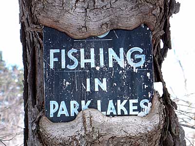
There used to be no fishing in this lake.
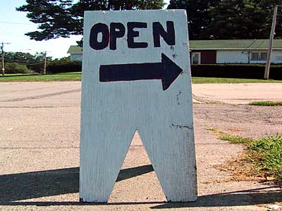
This sandwich sign has so much character it could probably walk on its own.
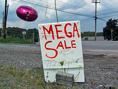
Looks like some quality stuff.
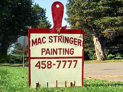
I might let them paint my house just so I can look at their sign all day.
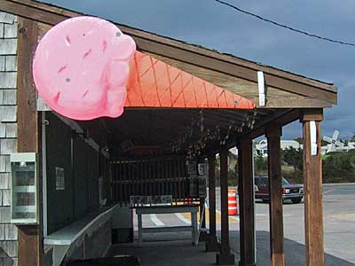
I love how the ice cream cone fits the roof line.
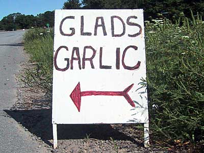
I would follow that arrow anywhere.
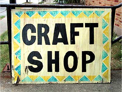
I like the graphic connection between Native American and craft.
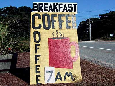
The great Philip Guston painted this sign.
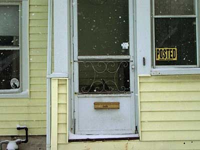
You usually see these posted signs out in the country but this guy posted his city house.
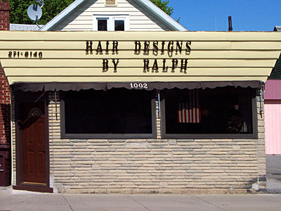
I’ll bet Ralph lives in the back.
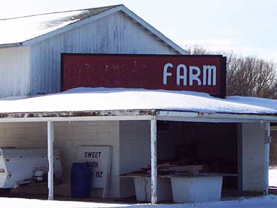
This used to be so and so’s farm but now it’s just a farm. Love the unicase.
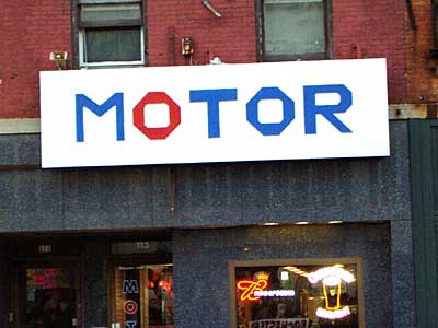
I love it when the lettering fits the wording so well .
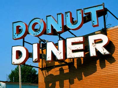
What’s for lunch? How about donuts?
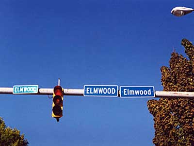
This must be Elmwood Avenue.
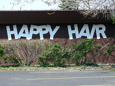
I like the mental image of “Happy Hair” and this lettering suits that perfectly.
They pulled out alll the stops with this signage. The organic shape of the sign and the five globes make this whole structure look like a royal crown.

The typography and message are in perfect alignment.
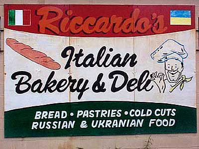
The Norton Street neighborhood is changing.
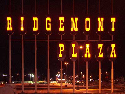
We are so lucky that this sign is still standing – a masterpiece!
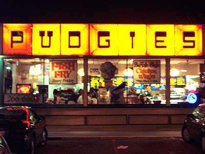
I love the lettering at Pudgies. At night this place looks like a movie set.
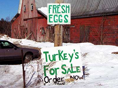
Why is “turkey” possessive?
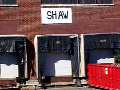
A two syllable word. Sh-aw.
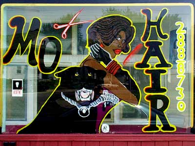
At most barber shops you get less hair but here you get mo. I’m sort of afraid of that dog though.
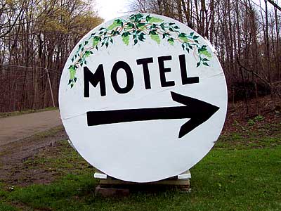
Strangely inviting and foreboding at the same to time
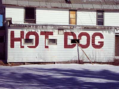
Looks like they ran out of room for the final “S.”
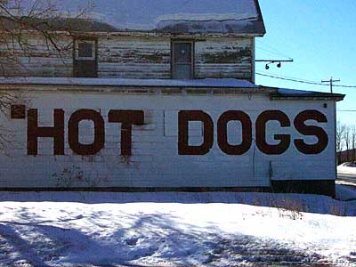
But they did get it right on the other side of the building.
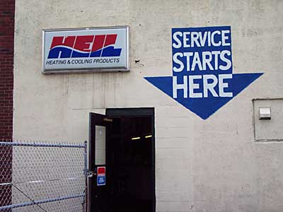
I love how they used almost all the space inside the big arrow but didn’t manage to line up the arrow with the door.
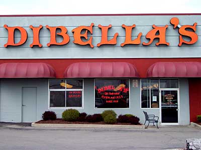
The Devil’s lettering.
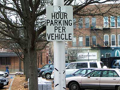
Is “Per Vehicle” really necessary?
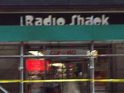
The Radio Shack in Olean has a logo I haven’t seen in a while. It makes me think of the words “radio” and “shack”.
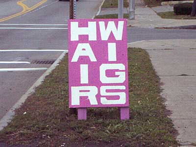
The temptation is to read left to right.

This name says it all.
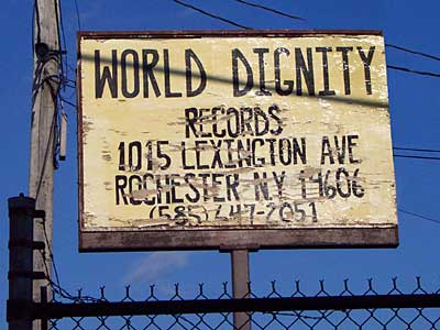
Giving Rochester’s Earring Records a run for their money.
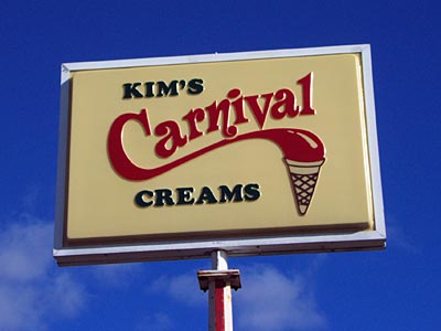
Kim’s Carnival Creams rules the corner of Atlantic and Culver.
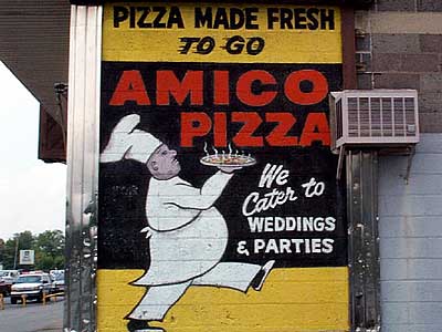
Hand painted right on the building, a lost art.
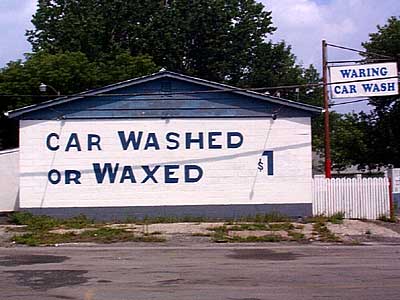
Fantastic use of space. Out of this world pricing.
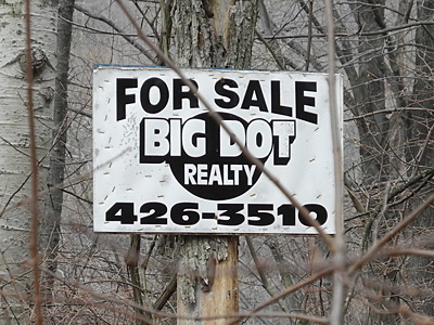
I always trust the Big Dot.
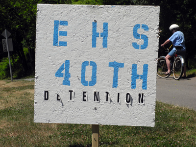
After forty years they still have that sophomore sense of humor.
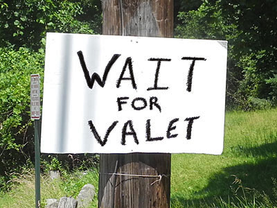
I know the neighbors with the funky driveway had a party over the weekend but their sign looks a little eerie on a Monday afternoon.
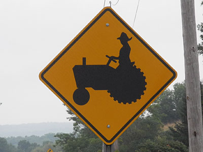
The posture on this guy puts my yoga teacher to shame.
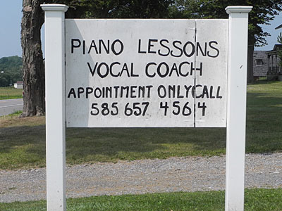
If they can sing and play as good as they paint a sign I’m in.
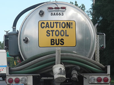
Nothing cute about a septic truck.
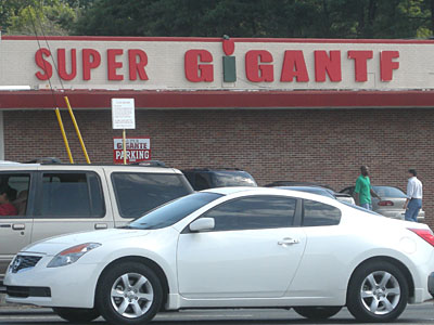
I like the mix of condensed and extended faces. But Gigantf?
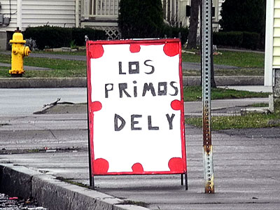
Never seen Deli spelled this way.
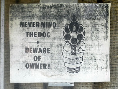
How many generations of copies is this?
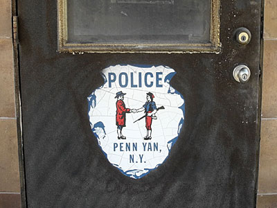
You can keep your guns for a small donation to our policeman’s fund.
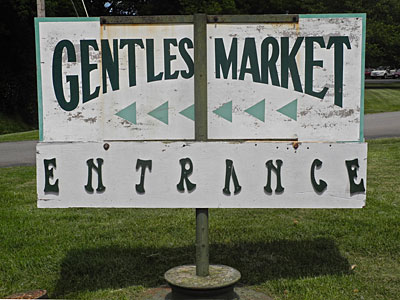
And be prepared to wiggle when you enter.
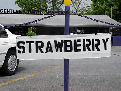
Sorry, only one to a customer.
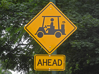
Warning: Cigars, plaid shorts, spiky two-toned shoes.
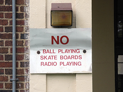
None of that kid stuff.
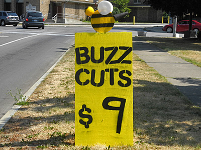
Buzz me baby.
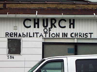
This is what rehabilitation looks like.
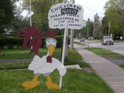
A happy chicken participating in his own demise seems doubly cruel.
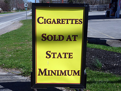
We would give them away if the state would let us.

