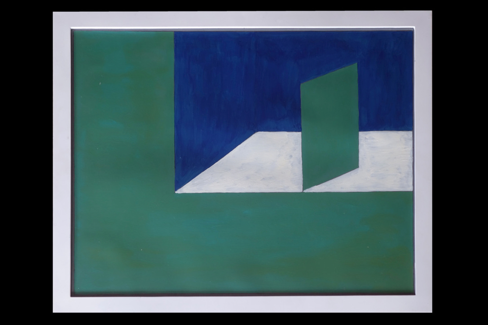
Stewart Davis acrylic painting on paper in a white frame on a black wall 2017
Stewart Davis, no, not that Stuart Davis, turned 80 this year. His wife, the artist, Anne Havens, compiled a book of his recent paintings. A lawyer, Stewart started painting late in life but you would never know it. He was eternally young and where most artists strive to paint as directly as they did as a child Stewart had no baggage to shake or unlearn. He was innocent. His art was pure.
Stewart painted in his garage in Rochester. And when Anne and he began to winter in Florida he painted in their garage there. They never came back this summer and Stewart told us he was painting with a fan on. We bought this piece (above) at RoCo. It attracted my eye immediately and I couldn’t get it out of my head. We arranged to buy it on the way out.
Stewart and Anne were/are champion patrons of the arts. Rochester has suffered a huge loss with his passing. But Stewart will always be an inspiration.
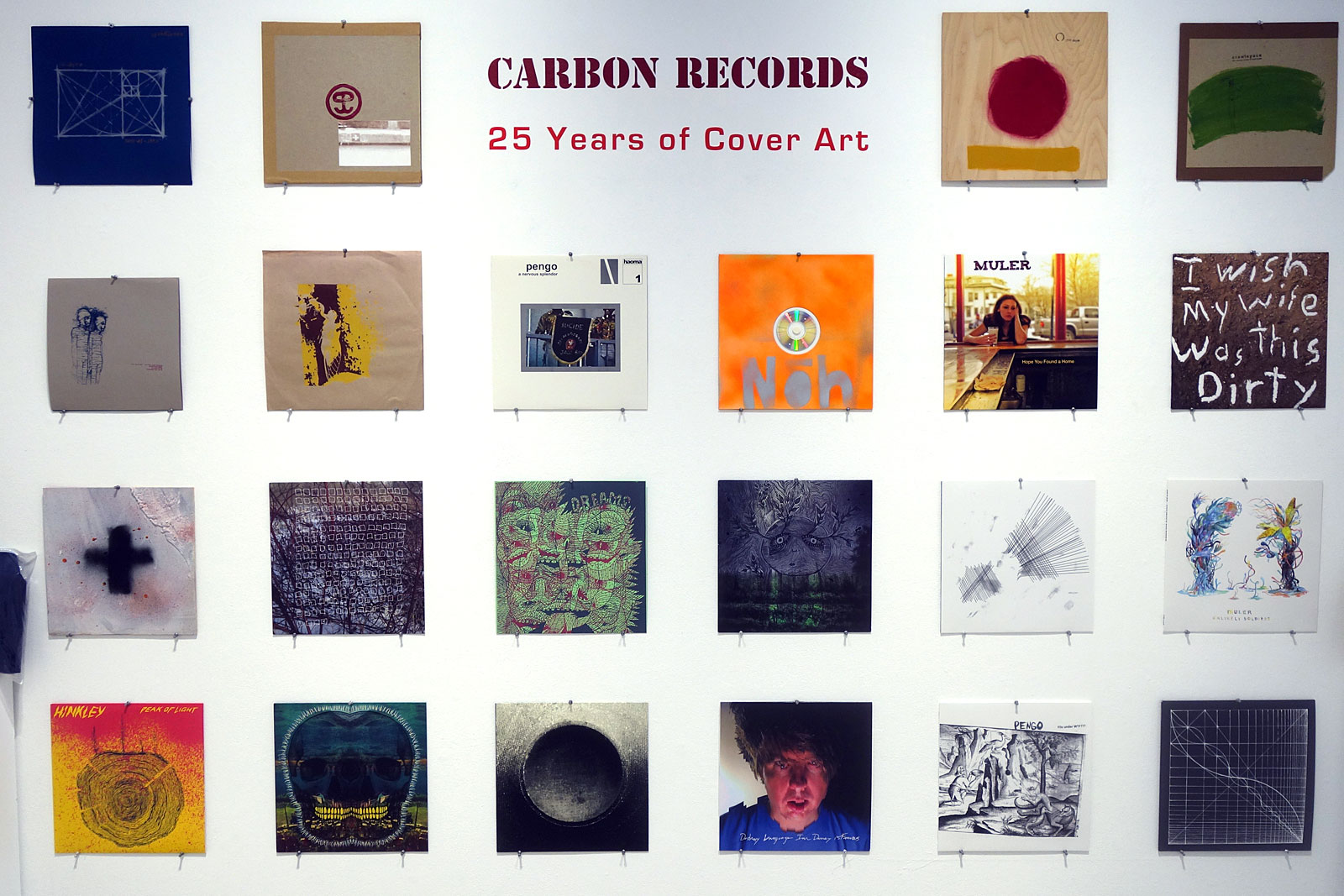
Joe Tunis artwork in Carbon Records: 25 Years of Cover Art at Rochester Contemporary in Rochester, New York
I know the quality so the word “stubborn” caught my eye in Chad Oliveiri’s accompaning wall text for Joe Tunis’s “Carbon Records: 25 Years of Cover Art” show at Rochester Contemporary, It reads “Carbon has been stubbornly releasing music from artists on the fringe of the Rochester scene and far beyond for the past 25 years. It’s a record label Joe Tunis started because he was obsessed primarily with packaging.”
Joe’s label, Carbon Records, started releasing records in the summer of 1994. They were mostly bands Joe was involved with but the improv/noise/drone/experimental label has gone international. They are giving Earring Records a run for its money.
We spent about an hour in the Lab Space at RoCo on opening night, studying the artful packages for (mostly) bands we have never heard of. The wall above features the 12 inch format. That’s Nod, “So Much Tonight,” third one in on the bottom row. Each package is as striking as it is unique. I hope you’l have a chance to see this show in the next month.
I submitted a few of my Police Composite collages in Rochester Contemporary’s “Cut & Paste” show and one got in. I’m not sure which one got in but I’m guessing it was this one. The show opens tomorrow night and features collage artwork by over 100 artists. That is one surefire way to get a big crowd at the opening.
Eleven o’clock seemed a little early for a beer so I passed until halftime but then gave in when Croatia scored. We watched the World Cup Final down at our neighbor’s place. They had a few of their Jamaican friends over and we all pretty much cheered for Croatia. They played a better game but lost. The only statistic that really counts is the number of goals. There was quite a bit of food and the match flew by. I wanted it to last forever. One of the guys brought cod fritters (cod, broccoli, batter and habanero peppers). They were killer! We brought two home for dinner and had them with a fresh salad, arugula, kale and cilantro, all from the garden.
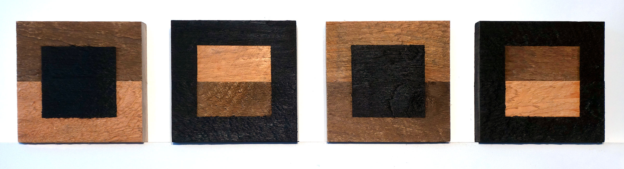
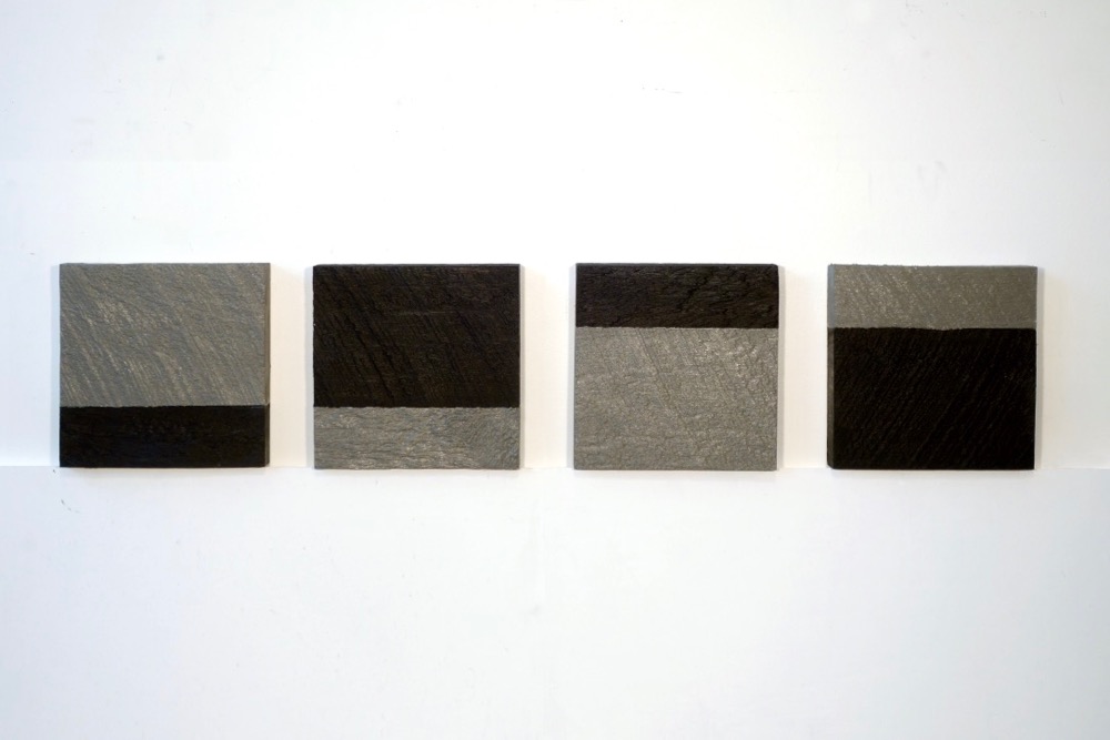
We picked up our 6×6 purchases this afternoon and I photographed three of them out in the driveway. I’m really happy with these. The first one, probably done by a kid, is every bit as cool as Hans Hoffmann’s push pull stuff. It commanded the main wall as you walk in the gallery. The beachball is an irresistable knockout. Just a bit of the air has escaped and the three primary colors heroicly define the form while the white circle on the top of the ball is just small enough to make you question it all. And that hotter than July ground! As my neighbor pointed out “La Avocat” should really be “L’avocat” but it is not. The painting is not the fruit either even though it says it is. We had to bring this home.
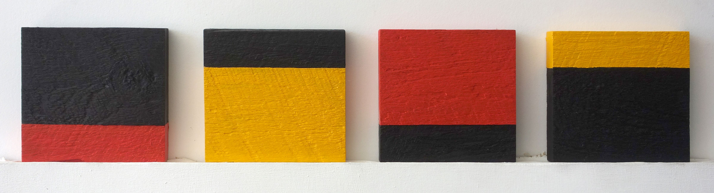
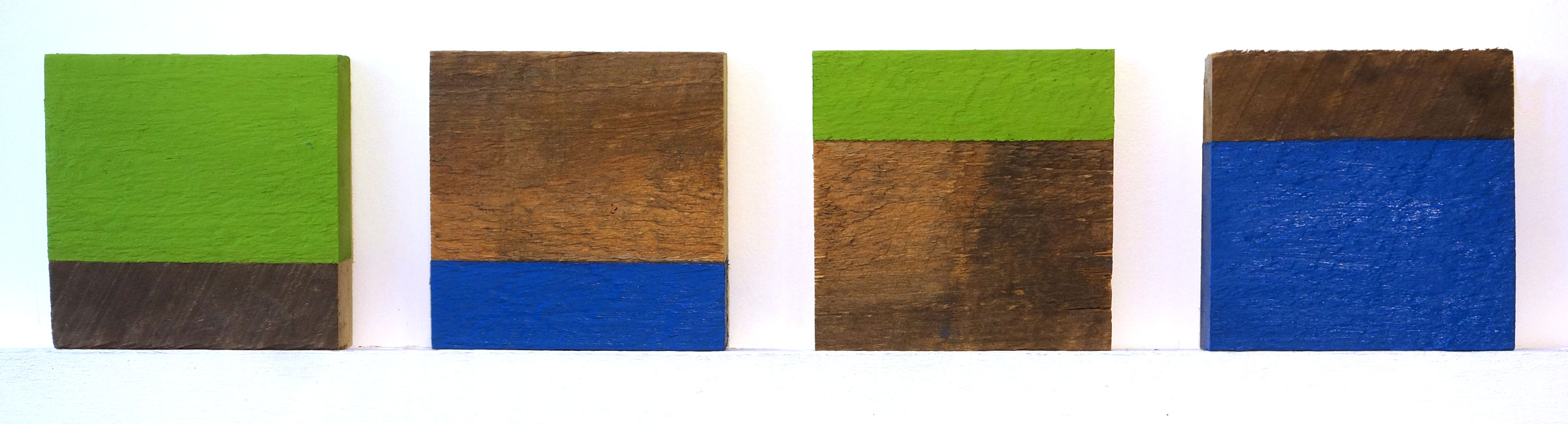
Raw Adirondack Pine pieces glued together for Rochester Contemporary’s Annual 6×6 Exhibition
RoCo is accepting entries for their annual 6×6 exhibition and they included PopWars on their promo list. “We are reaching out to you because here at RoCo we think your readers at PopWars would enjoy learning about it. The deadline is quickly approaching and we would love if you could help us promote such an important and unique event. Would you be willing to write something about 6x6x2018 and invite your readers to participate?” It is not exactly what I do here but of course I will pitch in.
I’ve been gluing two pieces of rough cut Adirondack pine together for four years now and I’m hoping there is still some life in the concept. The boards, that Pete and Shelley bought from a sawmill for me, were only around five inches wide so making a six by six piece required ripping, gluing and clamping. Instead of ripping to three inches so the two pieces would be symmetrical I found these pleasing proportions and painted the two pieces a different color to accentuate that.
The first ones were each two colors, right out of the tube. The second year I only used one color on each leaving the other part of it as raw wood. The third year I cut the two pieces of wood the same size, glued them together and painted either a center panel or the surrounding of a non-painted center panel.
Each of them sold so I’m pushing it a bit further this year. Each of my four blocks uses the same two colors. If they sell I will try submitting the raw wood panels above as is next year. In today’s political climate I’ve been thinking of them as my wall prototypes.
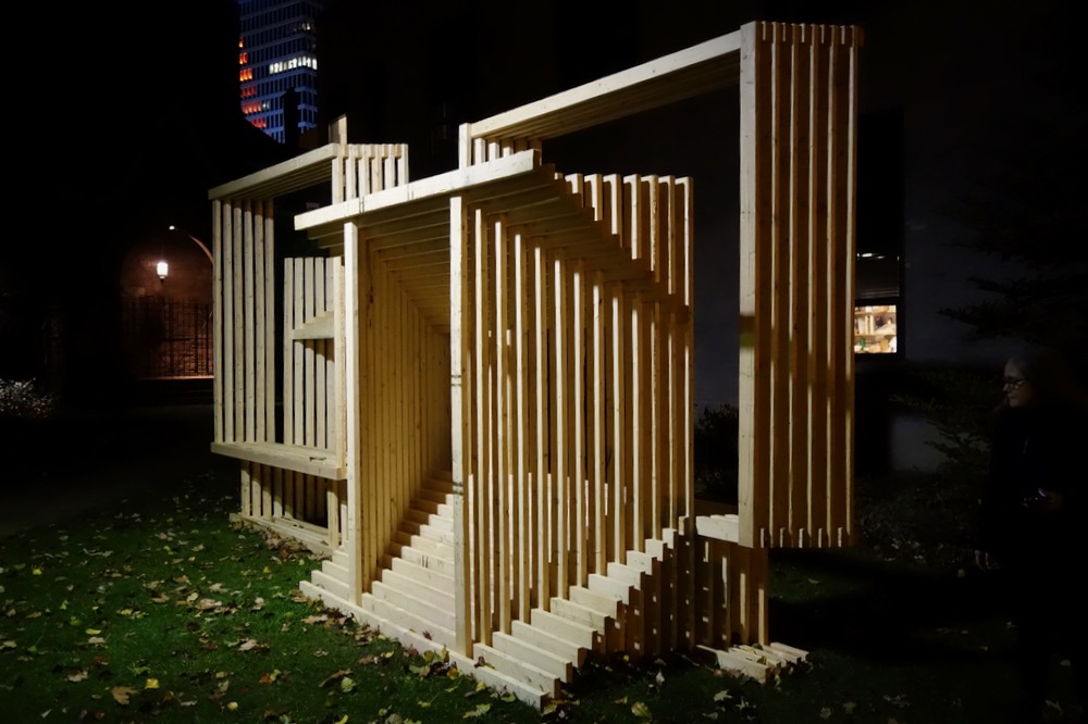
Matthias Neumann “Double Bench” outside at Rochester Contemporary
Is it enough that the artist finds something interesting? I found myself pondering that question last night while talking to New York based artist, Matthias Neumann, at the opening reception for his “Double Bench.” We told him we stopped to study his sculpture on the way in and there was a woman sitting on it. He offered that he was interested in the juncture between non-objective and functional object. And he pointed out that he did call it a bench.
I was really struck by how beautiful the wood looked. His piece is made entirely of untreated 2x4s, held together with wood screws that are for the most part not visible. I roughed houses for a few years and built walls with 2x4s. We’d build them on the deck of the house. Plates, studs, corners and cripplers all built out of 2x4s. If it was an exterior wall we would sheet it, cut out the openings and then someone would yell, “Wall going up and we’d all help hoist it.” They were clearly walls, functional but beautiful.
Double Bench is part of an ongoing series of sculptural interventions that have been installed in public spaces throughout the US. It will on display all winter outside Rochester Contemporary.
We got to know Rick Hock a little at a time. Steve the mailman would talk about him as “another music nut,” someone we should know. Rick lived the next block over, on Barry Street. My cousin lived on that street too and we never saw her. Steve used our bathroom because we worked out of the house. He’d bring us cookies that the ladies at Elite Bakery would give him when he delivered their mail and he always had the new Neil Young record on the day it came out because he friends with Kim at the House of Guitars. Steve kept telling us “we had to meet this guy.”
We met Rick’s wife first and she offered us a kitten, one born to a scraggily white cat that lived under their house. Stella, who is solid white like her mother, is seventeen now and a real sweetheart. Every time we saw Rick we’d tell him, “we still have that cat.”
Rick was someone you wanted to get to know. He was intriguing and opened himself slowly so that each encounter was an adventure. He played guitar and jammed with Peggi and me in our neighbors’ (Willie and Ethylene’s) driveway while they were having a garage sale. Rick was an artist and he converted the attic in his house into his studio. He worked at the Eastman House and curated some of our favorite shows there.
Rick was dark and sweet at the same time. He was very bitter about the Vietnam Nam war and it didn’t take much to get him going on politics. He was frustrated about a lot of things but always looking for an opening or a way to express the madness. The last few times we saw him were heartbreaking as we learned he had cancer. He died when he was on a roll.
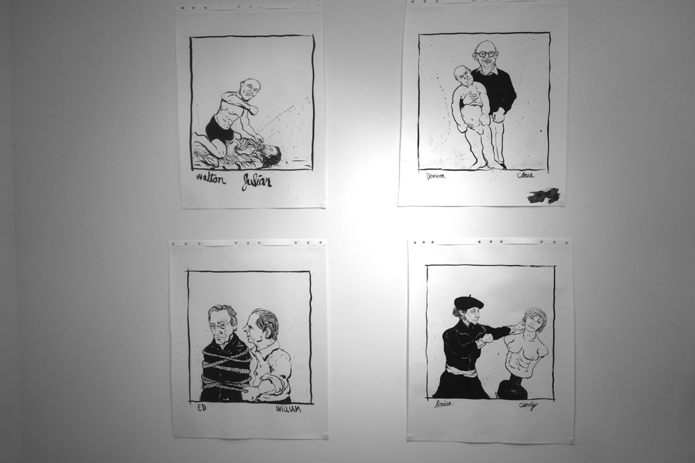
His drawings, on display now in the small gallery at RoCo, are explosive. I hear these are some of the last things he did so the show was put together without Rick’s guidance. The large drawings portray pairs of artists locked in battles. Joseph Bueys beating up on Warhol etc. RoCo has made these pairs out to be winners and losers, favorite artists putting posers in their place, but I like to think they just portray the struggle, to make art, to create, to be successful in the market or true to the creative gods. Artists vs. art.
There are ten of them here, even one that Rick didn’t title which RoCo has turned into a contest to identify. I cast my vote and am pretty sure I have the answer.
Bruce Nauman, Kara Walker, Anselm Kiefer, Francis Bacon, Joseph Beuys, Walton Ford, Claes Oldenburg, William Kentridge, Louise Bourgeois, Andres Serrano Tracey Emin, Jeff Koons, Elizabeth Peyton, Andy Warhol, Jackson Pollock, Julian Schnabel, Damien Hirst, Ed Ruscha and Cindy Sherman are all there. Don’t miss this show.
Here’s the Meredith Davenport’ statement that accompanies the show:
“Drawing was a fluid way for Rick McKee Hock to metabolize ideas and to connect with people, whether he was sketching his frustrations out in a meeting or sharing complex feelings through the loving marks on a birthday card, it was the process of drawing that was a primary connection to the world around him. His fascination with the mark and to visual language combined with his intellectual complexity would move him towards the photographic images he is so well respected for.
But the drawings are essential. They are artifacts of the conversations he was having with the world- sometimes profound, occasionally banal and most times they were very funny. A few times they were also terrifyingly prescient. He struggled with the limitations of his drawings. Were these “cartoons”, truncated one-liners that could not transcend into the deeper things he felt and observed and tried to express? How could he imbue these marks with more? It was a constant struggle for him because he loved the mark and the paper and the pen even more than the silver image.
Like many artists before him, Rick located himself in the creative cosmos through the artists he admired and he made reference to them in his work. Maybe it was a way for him to commune with their ideas or to pay homage to the impact they had on him? He made an early set of small engravings of photographers he respected and his polaroid works reference writers like Ezra Pound and William S. Burroughs. In these drawings, he was into deeper questions about contemporary art through narratives he created via the artists he admired and hated. The marks and humor were a way for him to think about and distill their work and their careers. They are a beautiful expression of his own labor to resolve the tensmn between his big brain and his skilled and intuitive hand.
For me these drawings are also a love letter. When he made them, I was in New York City taking two‐week drawing course at the Studio School. Each night, after eight hours of classical figure drawing, I would receive a photograph on my cell phone of one of these drawings that he made during the day. It was his way to be with me. He knew that I also battle with similar questions in the contemporary art dialog. He worked with artists I admired like Louise Bourgeois and Bruce Nauman. In his drawings their authenticity always defeated the charlatans. We were somehow all in this fight together!”
– Meredith Davenport
David Liittschwager “One Cubic Foot” lecture at George Eastman House in Rochester, New York
Seneca Park Zoo and the George Eastman House joined forces to bring photographer David Liittschwager to Rochester to photograph and catalog the the contents of one cubic foot of the Genesee River ecosystem. Liittschwager dropped his cube about one hundred and fifty yards south of Rattlesnake Point across from Turning Point near the mouth of the Genesee and gave a lecture tonight at the Dryden Theater. He showed amazing photos of microorganisms that were taken just this afternoon and time-lapse video footage with Great Blue Herons standing near the cube. Rochester Contemporary plans to have a show of his Genesee River photos in February.
In the bathroom after the lecture everyone was complaining about how they were unable to hear the talk. We were in the front row of the packed theater and I thought it was just us. Judging by the voracity of the complaints I’m really surprised someone didn’t speak up. The visuals were stunning.
After the talk Roy Sowers gave me some fresh Sunflower stalk paper that he made. He had me smell it. It smelled like a barn. I asked where he works and he said, “the Center.” And then I heard part of the story about the a lawsuit over the Center’s new logo. I say part of the story because I don’t know any of the facts here but I am interested in these sort of issues.
The Center had called itself “The Genesee Center for the Arts and Education.” More than a mouthful. They changed their name to “The Rochester Arts Center.” Rochester Contemporary has been using “Arts Center” after their name for a long time. They may have usage rights to “Rochester Contemporary Arts Center” for all I know. Peggi and I did their logo when they changed the name from Pyramid and then it was just Rochester Contemporary in the logo. So, if I have this right, The Rochester Arts Center steals three of the four words in Rochester Contemporary Arts Center, effectively one upping Rochester Contemporary and making RoCo look like an affiliate or subsidiary of The Rochester Arts Center. We have friends in both organizations but it sounds like cease and desist or lawyer-up time to me.


