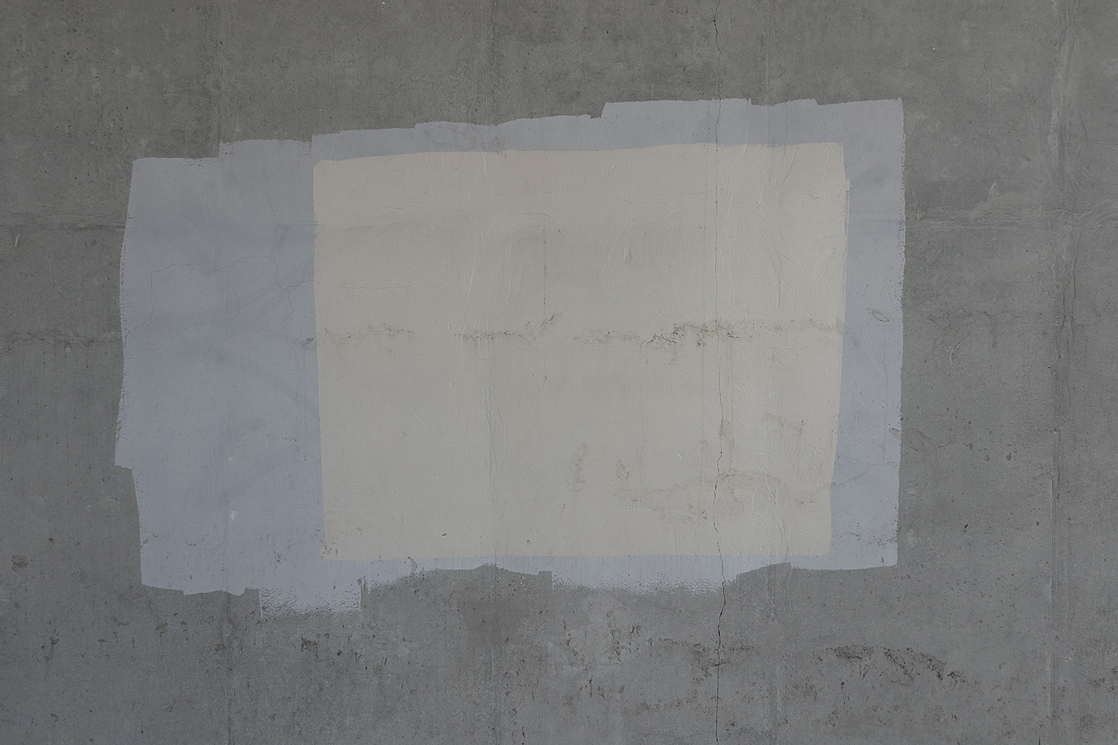
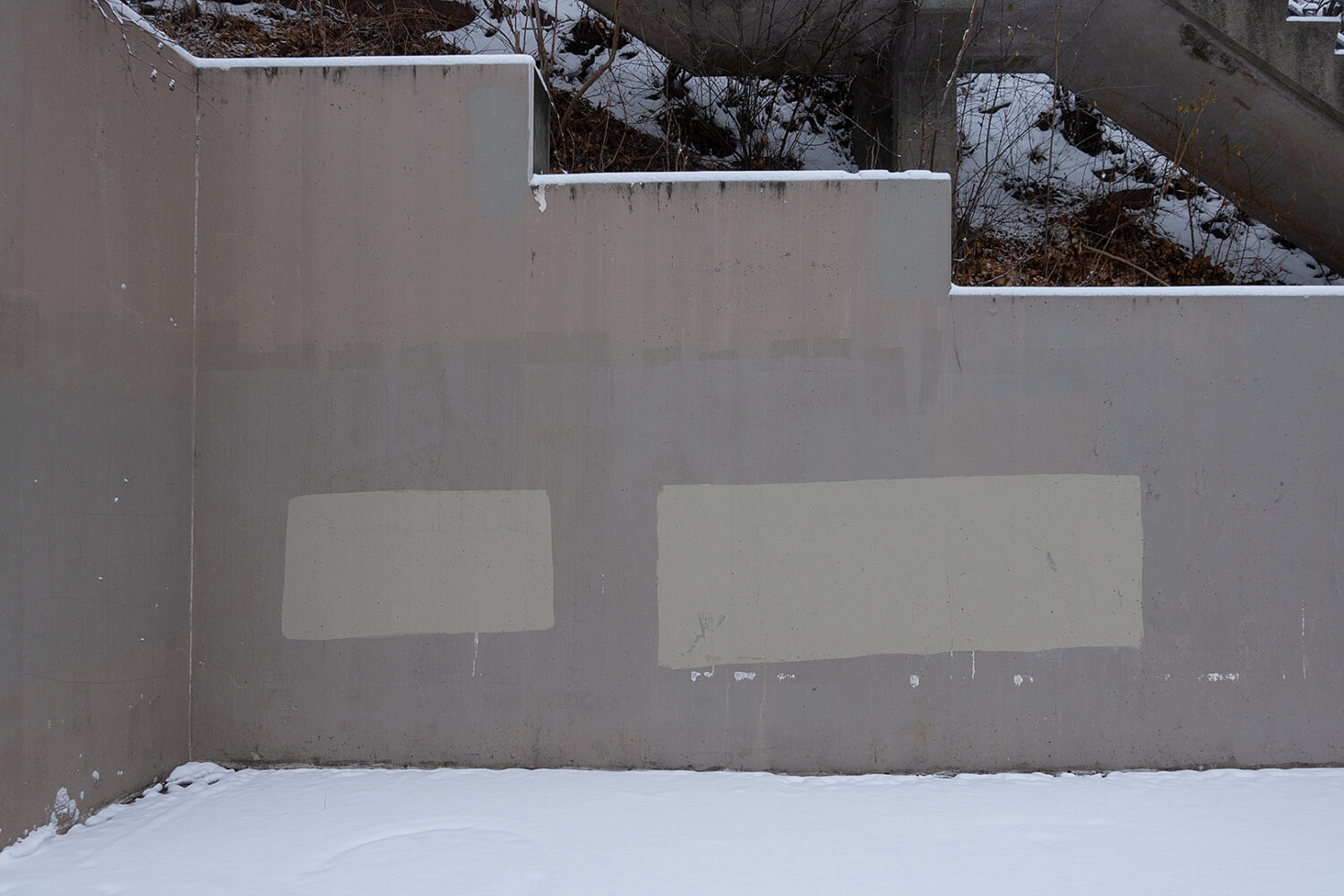
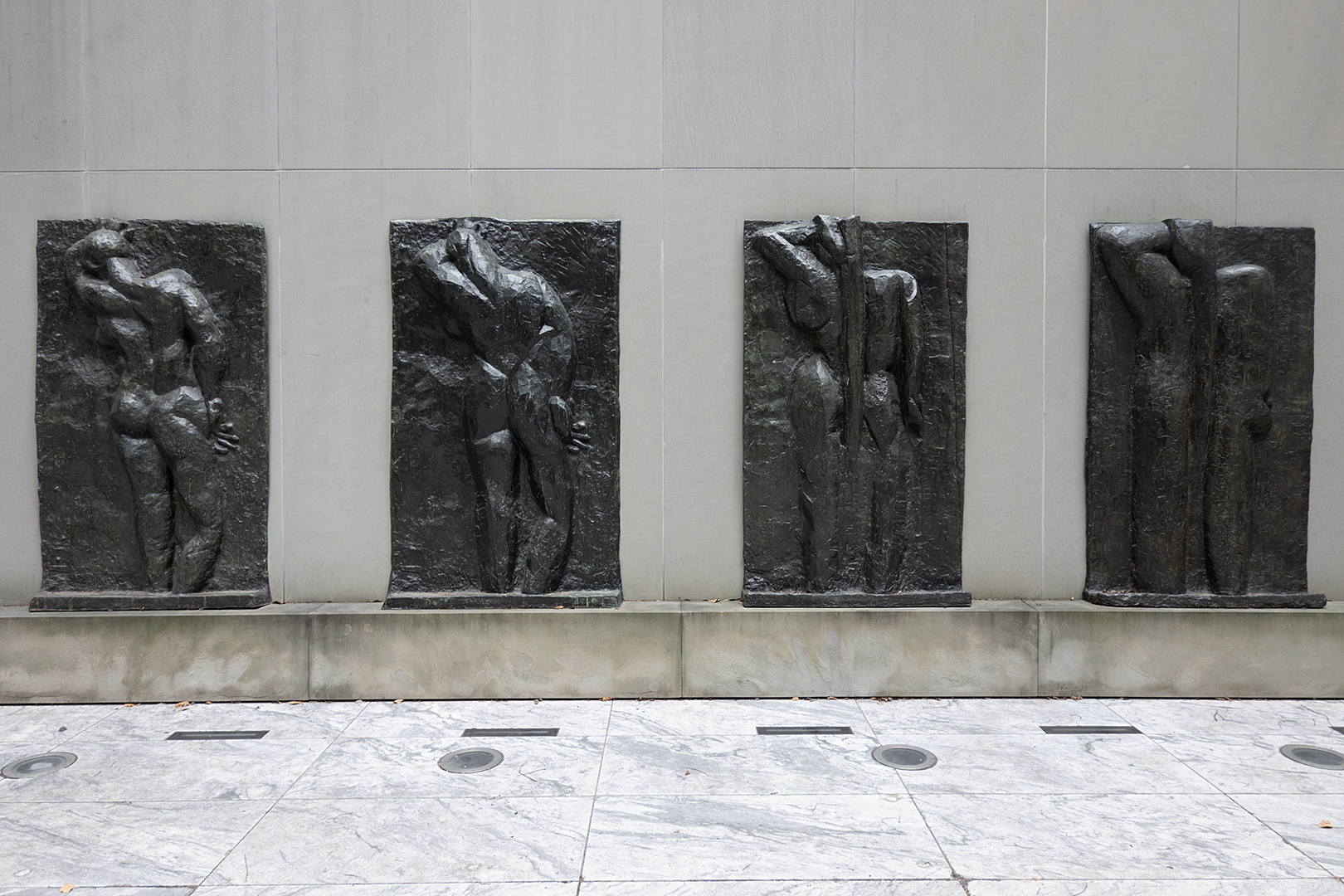
Graffiti Cover Up paint on wall under Expressway on East Ridge Road
Graffiti Cover Up paint is specifically formulated for blocking out graffiti on exterior surfaces. Sherwin Williams sells the water-based flat paint in five gallon buckets. There must be many companies making the product because the colors, all in the reduced palette family of grey, never quite match each other or the brutalist concrete structures they are applied on.
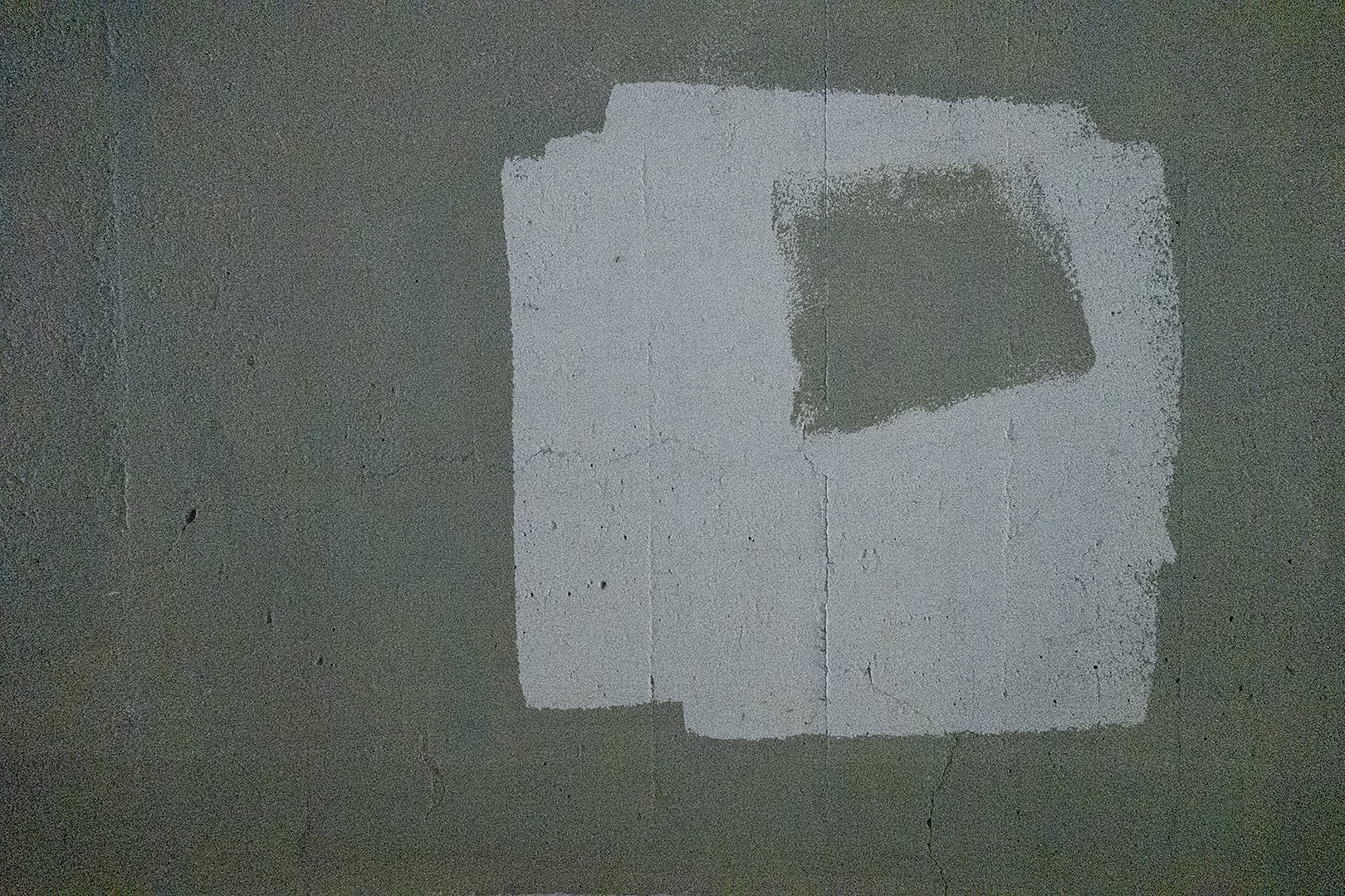
Graffiti cover-up paint under bridge in Toronto
The paintings are obviously done with a roller and the strokes are applied confidently. I find the shapes expressive and suggestive of forms.
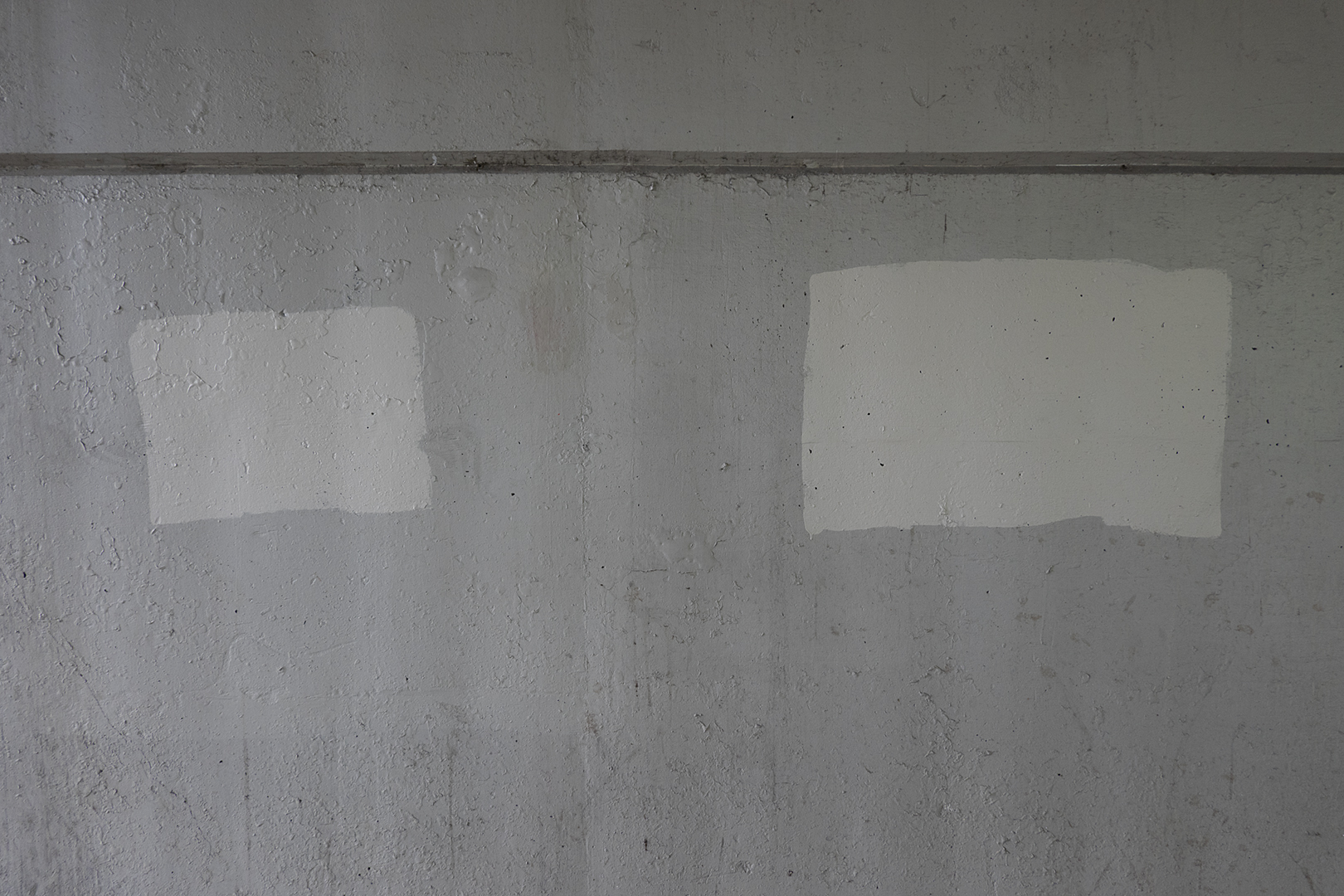
Graffiti Cover-Up paint on wall under South Avenue bridge
They are often animated and in dialog with one another like these two in downtown Rochester.
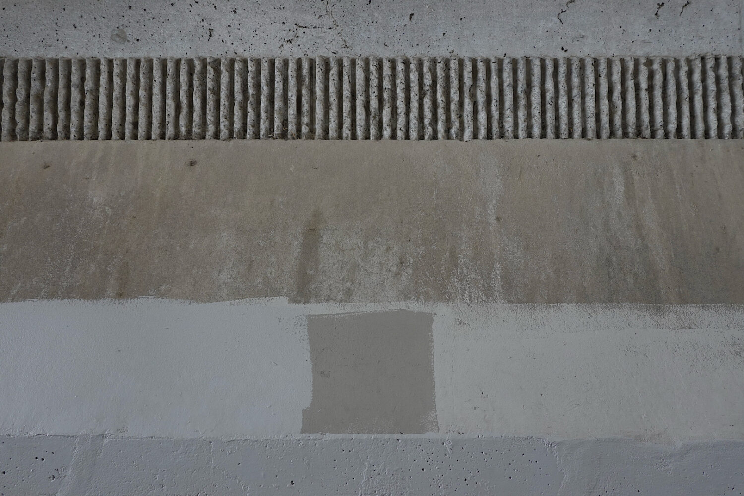
Graffiti Cover-Up paint on wall under the 101 in Sausalito
The work above, under Highway 101 in Sausalito, is sensational although it has probably changed since we were there in 2025.
Graffiti cover-up paint on wall leading to Seneca Park bridge
The colors on this wall, in the white cube gallery of Olmstead’s Seneca Park, are particularly striking. The paintings in all of these photos, created by anonymous public works employees looks more interesting this painting we saw in Chelsea.
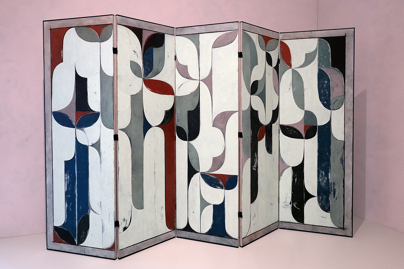
Decorative room divider by Kamrooz Aram at Whitney Biennial
Peggi and I took a break at the Whitney and had a beer at the outdoor café on the eighth floor. I put my camera on the table and took a timed photo of the two of us. We don’t do many selfies, so it got more attention than most of my posts. And because I said, “We survived the Whitney Biennial,” I was asked about it several times at our Margaret Explosion gig.
I shouldn’t have been so snarky. I loved the decorative work by Kamrooz Aram. And there was a video in one of those dark rooms about an orchestra that really captivated us. And that beer tasted so good.
We went to three garage sales yesterday. Pete and Emily are moving to Italy, so they have an “Everything Must Go” sale going on. We stopped there first and considered buying a $200 turquoise guitar. We told them we’d think about it while we walked around. When we returned we saw a guy putting it in his car. We came home with a black Cuisinart cast-iron enamel Dutch oven, some glasses, and a crowbar. At the other two sales we mostly laughed and came home with two tiny square plates with the letter “P” on them.
“I Thought I Would Never” lithograph at Guston “Life With P” at Hauser Wirth
The Guston show at Hauser & Wirth, mounted in conjunction with the release of Life With P, a compilation of poet Musa McKim’s journals and poetry, remains top of mind.
We picked a pawpaw two years ago and let it sit on the counter for a few days. When the fruit felt relatively soft, we ate it and kept the seeds. Peggi nicked each one with a knife and put them in a baggie filled with topsoil for the winter, a process called stratification. She planted them in small pots in the spring, and twelve eventually emerged as tiny trees. We put those in a cool, dark place for the second winter and then on the windowsill in the spring. We just started bringing them out each day to experience a bit of the outdoors, and when it’s warmer we’ll leave them out. This fall we’ll put them in the ground, and they will be on their own.
Something went wrong with our Padrón peppers. Only eleven of the seeds we sowed have sprouted. We need at least twenty plants to ensure peppers each night. We ordered new seeds from Hudson Seeds and planted them in small pots yesterday. Our neighbor suggested we put them in a warm place—the theory being that peppers grow in warm climates. We planted our root vegetables: two rows of carrots and two rows of beets.
Untitled drawing from Philip Guston “Life With P” at Hauser Wirth
Duane took a train in to meet us at the Guston show and he told us that he could see us talking this one home with us. We did our best to bring the whole show home.
It must have have beat least twenty years since we were last in The Frick. It was before I started keeping track of things here because I found nothing in the search. The Frick rounded up other versions of two of their sensational El Greco’s and hosted a mini blockbuster with the variations. We made a special trip to see that.
El Greco’s Purification of the Temple and his Saint Jerome still steal the spotlight in the newly refurbished Fifth Avenue mansion. Other Spanish masters – Goya with his workers, The Forge, Velazquez’s his hapless King Philip IV and Murillo’s self portrait – are well represented. Vermeer’s lighting is a knockout. Bellini’s Saint Francis receiving the stigmata is a wonder. Hans Holbein the Younger appears to have actually preserved the real the Thomas Moore in his canvas.
“Pieta with Donor” Ca. 1450 Frick
Two versions of the Pieta, the Virgin cradling the dead Christ after the Crucifixion, both by unknown artists from the 15th century, were hung together in an upstairs room. They knocked me out. One obviously copied the other and both probably copied someone else. I love the idea of a rich diner hiring an artist to put him at the scene.
Precious Okoyomon’s 2026 Whitney Biennial installation,” Everything wants to kill you and you should be afraid”
One whole floor of the Whitney’s 2026 Biennial features Precious Okoyomon’s installation of suspended figures, stuffed bunny suits with 1930s/40s blackface doll heads, taxidermy feathers, wings, and teeth. It’s titled “Everything wants to kill you and you should be afraid.” We were not.
Aki Onda presents Ugnayan (1974), music for twenty radios composed by José Maceda at 2026 Whitney Biennial
Aki Onda presents Ugnayan (1974), music for twenty radios composed by José Maceda. Maceda wrote a fifty-one-page score, created separate reel-to-reel recordings of singers and musicians playing gongs and Filipino bamboo instruments, and worked with radio stations across Manila to play the tracks simultaneously. Blanketing the city in sound waves, Maceda’s composition returned music from the concert hall to everyday life. The piece is adapted here for boom boxes, each playing there own part.
We walked through the gift store on the way out and found an eight dollar Warhol banana sticker that looked like it would fit on my bare Velvet Underground & Nico album.
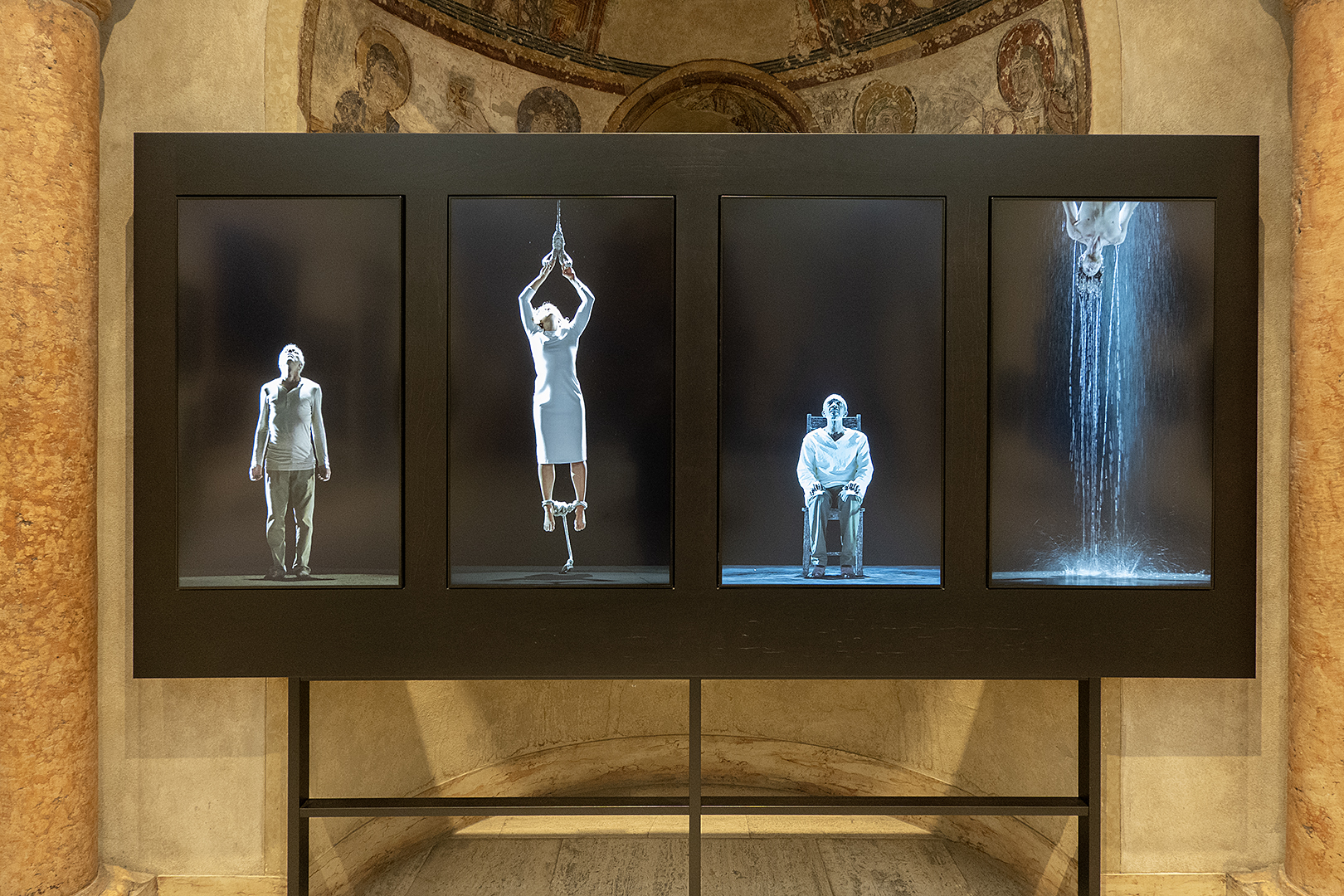
Bill Viola “Earth, Air, Fire and Water Martyrs” at MAG
The passage near where this Bill Viola piece is mounted reads: “The Greek word for martyr originally meant ‘witness.’ In today’s world, the mass media turns us all into witnesses to the suffering of others. The martyrs’ past lives of action can help illuminate our modern lives of inaction. They also exemplify the human capacity to bear pain, hardship, and even death in order to remain faithful to their values, beliefs, and principles. This piece represents ideas of action, fortitude, perseverance, endurance, and sacrifice.”
The special shows at the Memorial Art Gallery are usually the draw, but the collection itself is often better than the shows—especially under the direction of the last two directors. The place has come to life with exciting new acquisitions, adventurous pairings, and the rotation of works on paper from the collection—works like the Claes Oldenburg prints that can only handle a limited amount of light. It is the perfect place to feed your head.
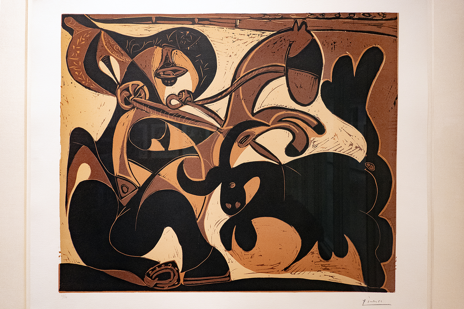
linocut from “PIcasso and the Progressive Print” at MAG
Picasso made about 200 linocut prints during the last fifteen years of his life, and there is a fascinating show of the working and final stages of three in the Lockhart Gallery now. “Picasso and the Progressive Print” shows the artist having fun with his Spanish heritage and mythology.
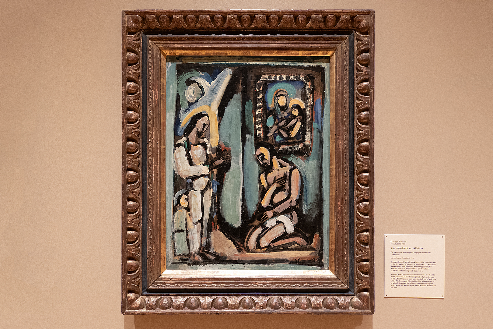
Georges Rouault “The Abondoned” at MAG in Rochester, New York
“The Abandoned” by Georges Rouault is one of my favorite pieces in the collection. It’s oil paint over an intaglio print on paper mounted to Masonite, and the theme is part of his Miserere series. My father had four Rouault pieces hanging over the couch in our living room when I was growing up—plates he had cut out of a Rouault book. The way they were painted, the religious subject matter—I found them so mysterious.
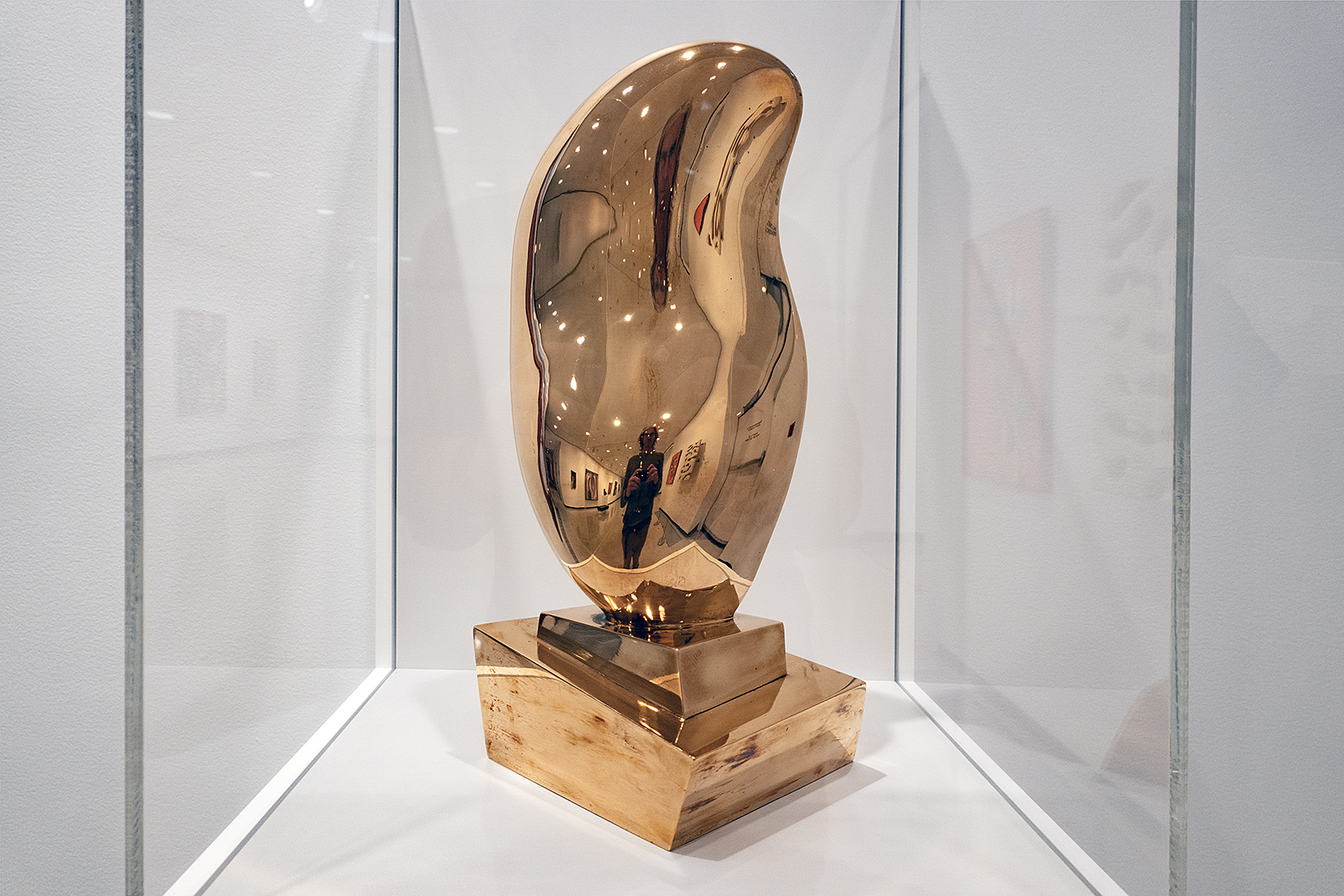
Jean Arp Leaf on Crystal (Feuille sur Cristal) Bronze MAG Rochester
Since the inception of the Media Arts Watch Gallery at the MAG, they have had one sensational installation after another. Rashid Johnson, one of Hauser & Wirth’s artists, has a video installation called “The Hikers” there now. And just outside that gallery is this beautiful Jean Arp bronze.
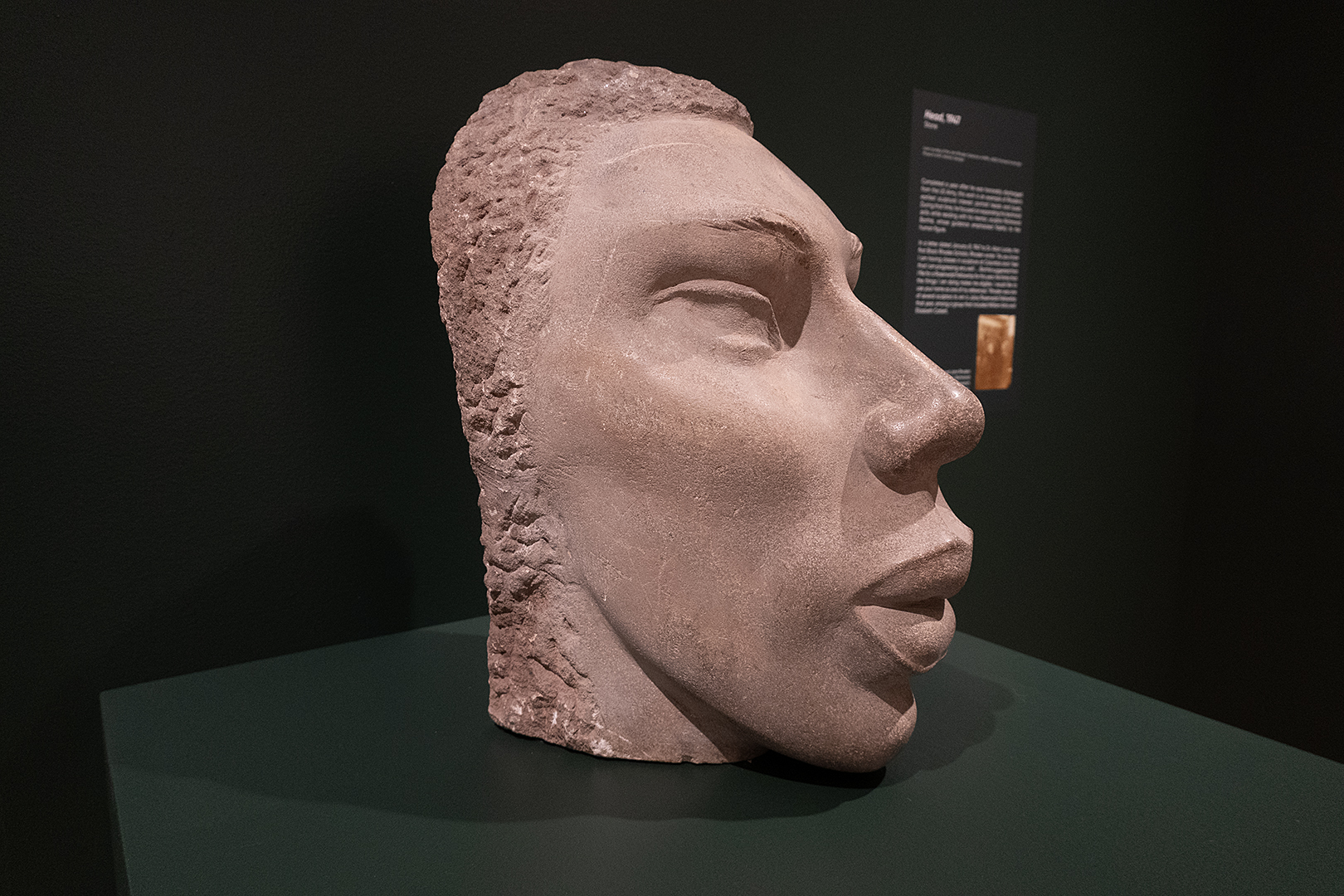
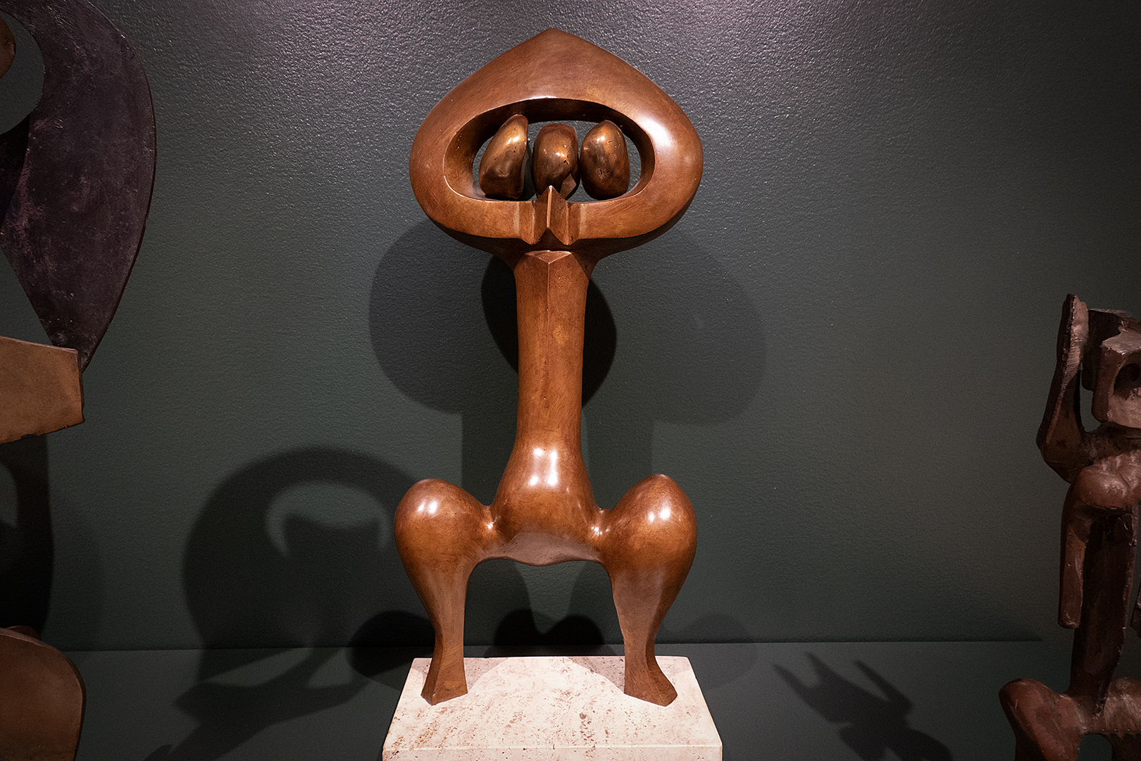
John Rhoden sculpture at MAG show “Determined to Be: The Sculpture of John Rhoden”
The last time we saw Shawn Dunwoody in person he was spinning records at the Bop Shop. Of course we see his work everywhere in the city. Shawn is a dynamo, and we got a chance to hear him talk about his projects at the Memorial Art Gallery yesterday. The auditorium was full. Shawn has a lot of fans.
Creating murals on buildings, walls, and roads is so much more involved than just painting. Shawn brings life to some of the most run-down parts of our city. He can secure large quantities of paint from Sherwin-Williams, and convince companies or the City of Rochester to allow him to transform the cityscape. His projects involve and lift up the communities there. There is real power in his art.
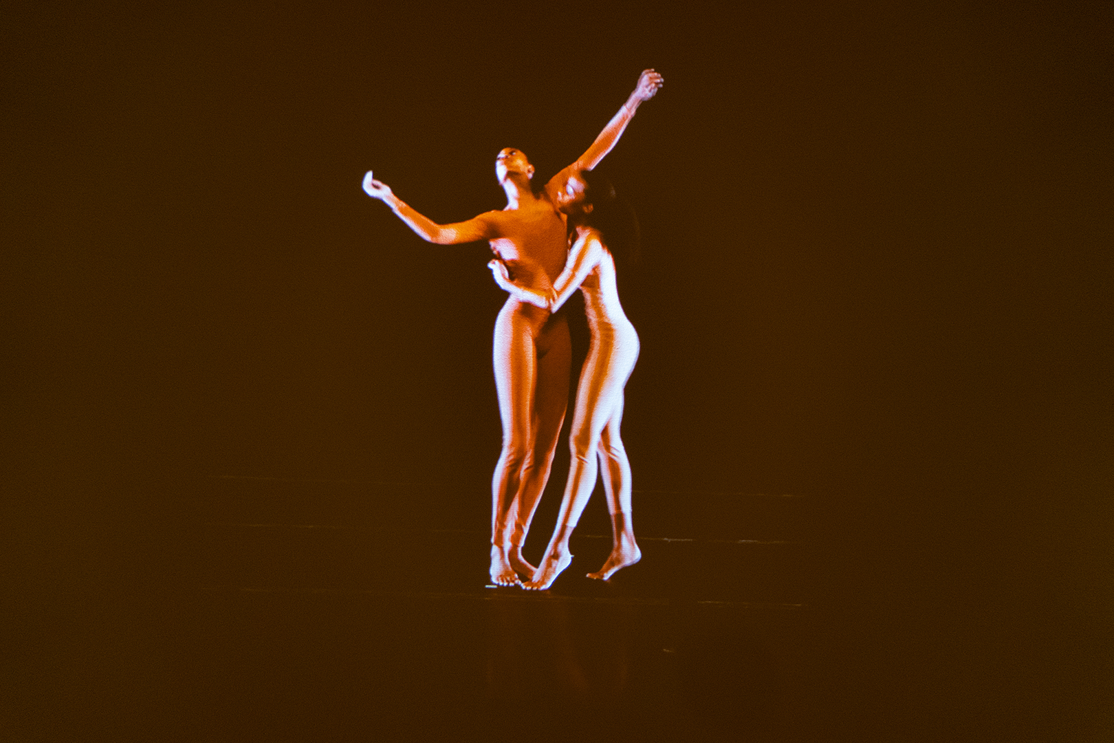
Garth Fagan dancers video at MAG show “Determined to Be: The Sculpture of John Rhoden”
When Shawn’s talk finished we took in the MAG’s new show, “Determined to Be: The Sculpture of John Rhoden.” According to the notes, “music was a fixture in John Rhoden’s creative and personal life—his studio space was outfitted with a concert grand Steinway piano that Richanda, his wife, would play as he worked.” The MAG’s Spotify setlist of the music that inspired Rhoden includes plenty of Thelonious Monk.
The MAG partnered with Garth Fagan Dance to explore the rhythmic qualities of Rhoden’s work and commissioned choreographer PJ Pennewell to create a series of short, original movements inspired by five sculptures in the exhibition. These performances are screened on the dark walls of the galleries and are as captivating as the sculpture.
John Rhoden sculpture at MAG show “Determined to Be: The Sculpture of John Rhoden”Leave a comment
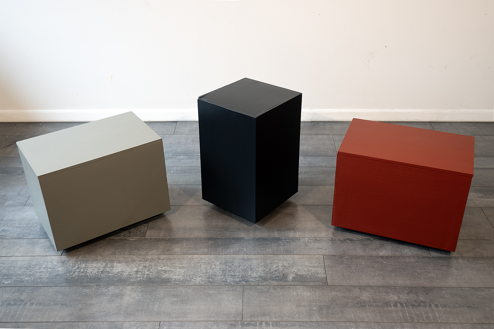
“Untitled” Three painted wooden boxes, 17″h 60″w 20″d 2026
Tim McGrain had a local band called “Three Boxes” back in the 80s. When we were talking with Pete the other day about his band, he reminded me of “The House,” a local band in the 60s. That is a great name. I’m still thinking about this piece and may just go with “Untitled.” “Government Secrets” is a possibility. The boxes are glued shut.
I had all these paint colors pre-mixed. The box on the left is the color of the outside of our house, something called “Burnished Pewter.” I like it because it looks like a dull Army green. I always have flat black on hand—my favorite color—and the orange-red is as close as I could come to matching the main color in our living room rug. I bought a pint of it during the pandemic when I was playing with the motifs in our carpet, something I was calling “Carpet Gaze,” but it will just remain in sketch form.
Anne Havens “Echoes and Variations” MCC Mercer Gallery 2026
We stopped up to visit Pete. He has been through a lot but we found him holding court and as cheery as ever. He calls his room on the seventh floor of the new wing on Highland Hospital “The Highland Hilton.” While we were there he let two calls go to voicemail, from friends of his who Pete told us require a certain amount of cheering up. The irony of someone in Pete’s condition providing inspiration to others was not lost on us.
Pete was born on the same day in the same year as Anne Havens. Anne too has had a few health setbacks but she has two art shows on the docket. The opening of “Echos and Variations” was last night at MCC’s Mercer Gallery. We cut our visit with Pete short and drove out there in hopes of seeing Anne at the opening. We were richly rewarded.
The brochure for the show had the following description of Anne’s process and I don’t think she would mind if a shared her secrets.
“For the most part, I am an intuitive artist, finding rather than ordering up, always looking around the bend. I search for shapes or situations that reverberate in me, following the pull of my motivation and energy.
I work in many media, and enjoy letting them bounce off of one another. Found materials, or objects, are often a source of inspiration, or triggers for action.
Much of my work on paper is an offshoot of my sculptural work, or continues my interest in materials in some way.
Ideas are often the jumping-off point for work, but hopefully the end-result will transcend them and reveal something significant, or surprising. I am interested in discerning what I have really been up to, rather than what I think I had in mind, and that is what keeps me fascinated with the whole enterprise.
My art-making is my way of dealing with life. It lets me act out, exorcise, focus, resist disintegration, and, most of all, be surprised. I can only hope that the metaphors that I find in the process will have echoes for others as well.”
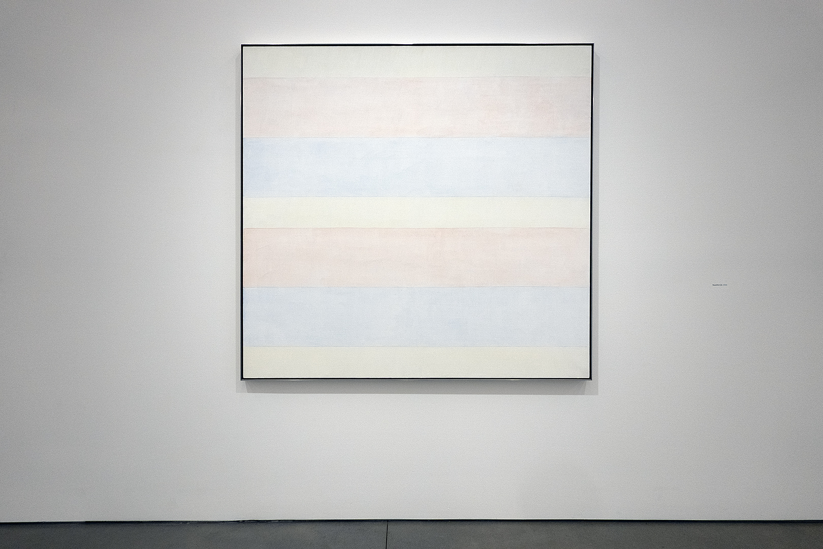
Agnes Martin “Beautiful Life” 2000 granite and oil at Pace in Chelsea
Mary Alice, Peggi’s mom, gave me a book that she had read about in the Wall Street Journal for Christmas. Twenty years later “Pictures of Nothing” by Kirk Varnedoe is still one of my favorite art books. Varnedoe describes Agnes Martin’s work as “utterly incorporeal: no body. . . at the other end of abstraction and yet not at all cerebral. . . thoroughly dependent on sensory and sensual experience.”
Agnes Martin writing on wall at Pace in Chelsea
“Agnes Martin,” currently on view at Pace in Chelsea is stunning. You can’t prepare yourself for it but you can take the experience with you. We started our experience by watching the short movie with Agnes Martin that Pace was showing in a side gallery. It was closer to a meditation. She tells us how she finds beauty and how that is enough. And although people say she was a mystic, she says she is not.
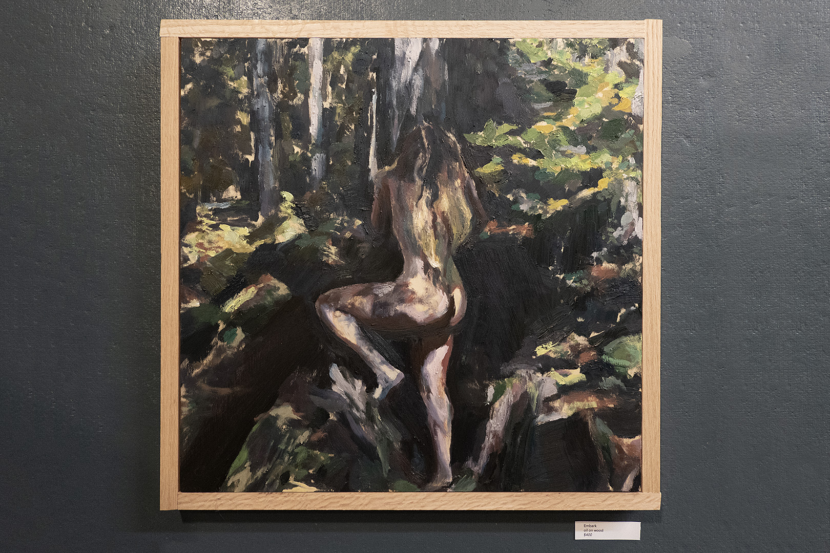
Sam Fratto oil on wood painting “Embark” at 420 Anderson Alley
My brother, Fran, was eating lunch when we stopped by on Friday, lasagna that he had warmed on the stovetop. It looked so good we decided to go out for Italian that night. Nearby Pasta Villa was the obvious first choice. Since they don’t take reservations we made a point to be there at 5. The bar was full and there was a forty minute wait in the dining room. We called Lucano’s on East Avenue and got in there.
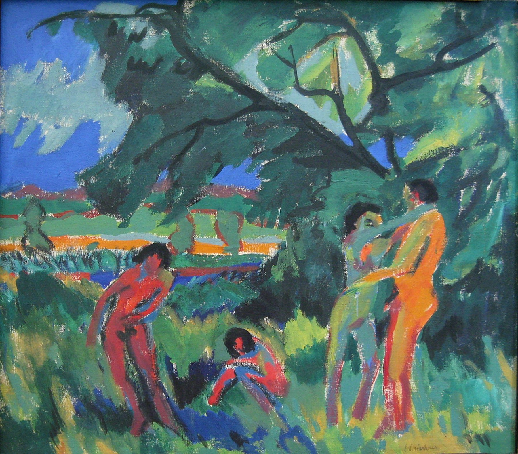
The night was still young. We stopped at Studio 402 for Sam Fratto‘s show of Arcadia paintings based on photos he took in the Adirondacks. I use the word “Arcadia” as in an idealized wilderness, a utopian place of unspoiled nature, harmony, and simple life. Like the retreats Kirchner and his fellow Brücke artists would take at the lakes outside Dresden where they bathed and created artworks depicting each other in relaxed harmony with nature. I’m hoping this genre comes back.
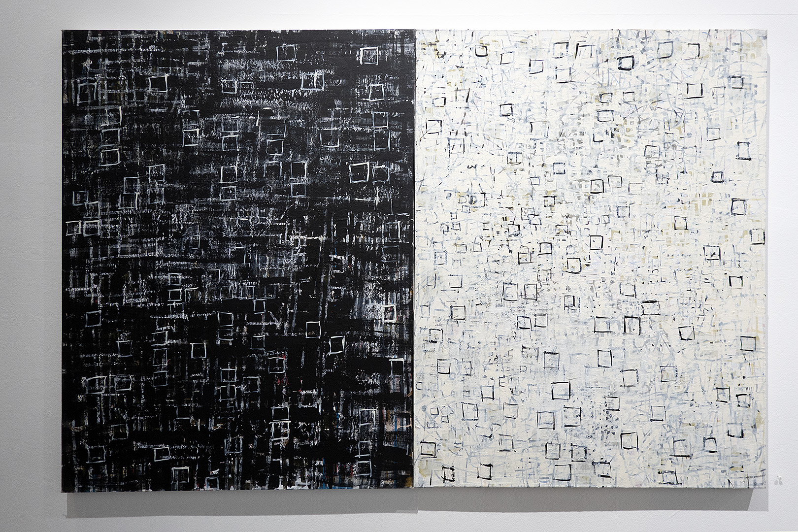
Karen Sardisko diptych at Colleen Buzzard’s
Next stop was next door at Colleen Buzzard’s for Karen Sardisko‘s show, “Paintings and Re-Imagined Monoprints.” I really loved this one on the big wall. Diptych’s are tricky. The two halves have to talk to one another. Getting one painting to work is hard enough. Getting two paintings to work with each other and have whole efficacious is a real trick. ( I almost said “kick ass” in that last sentence but settled on the synonym, “efficacious”)
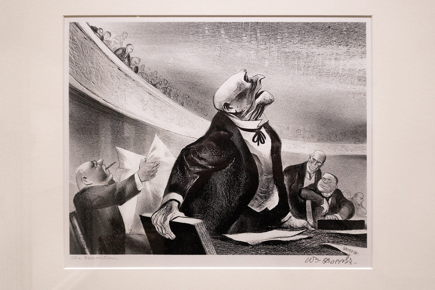
William Gropper “The Opposition” lithograph Collection MAG
I have admired the William Gropper painting in the MAG’s American Art gallery for many years. It is not there anymore. They’ve moved it to the Lockhart Gallery where the curators have built a show around it with works on paper, all from their collection, that can’t stand daily museum light. The lithograph above has the same title, “The Opposition,” as the painting but the print is better! More concentrated energy, more dramatic, marvelously 3-dimensional..
Like the great Honoré Daumier who satirized the bourgeoisie and politicians while championing democratic ideals, William Gropper is a social realist. Rockefeller had a social realist mural by Diego Rivera plastered over. We stumbled on Ben Shahn’s social realist work in Syracuse when we came face to face with his Sacco and Vanzetti mural. He depicts Italian immigrants who were caught up in America’s first Red Scare. (Shahn’s show at the Jewish Museum in New York has just been extended. Philip Guston took it to Nixon.) It is a risky business but their work stands the test of time.
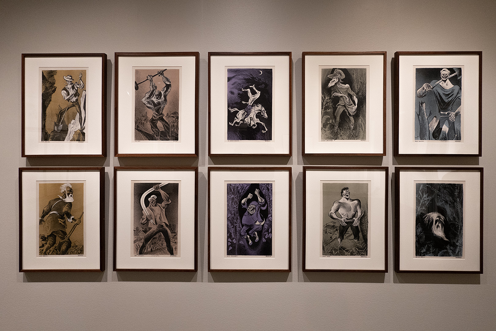
William Gropper “American Folklore Portfolio” 1953 Color Lithograph, collection of MAG
The color lithographs above were based on Gropper’s 1946 “Folklore Map of America,” a celebration of America in the aftermath of victory in World War II. The illustration appeared in Holiday Magazine and was widely circulated in schools and libraries throughout the country. And wouldn’t you know it, Senator Joseph McCarthy’s lawyer Roy Cohn, who was later Trump’s personal lawyer, found it in State Department libraries abroad and in 1953 he labeled Gropper one of the “fringe supporters and sympathizers” of Communism whose works had infected the State Department. Gropper was pilloried in televised congressional testimony and earned and became one the first artists of the era to be blacklisted. This was the second “Red Scare.” Take a glance at Gropper’s grilling in the Senate hearings.
The war on woke is raging. Books are being banned. The administration must approve the art in the Smithsonian. Mr. “fit-as-a-fiddle” Hegseth has gone on a rampage against “beardos” and “fat generals.” (What about the VP’s facial hair and the Commander and Chief’s gut?) Welcome to the third Red Scare.
New acquired work by Anthony Pearson and John Rhoden at MAG
The Biennial Finger Lakes Exhibition at MAG has been up all summer and we finally got over there to see the show before it closes on October 5th. The Sol Lewitt wall drawing on the way in is a marvel and the newly acquired pieces by Anthony Pearson and John Rhoden (above – an especially inspired pairing by the way!) had me really jacked up for a good show.
Entering the Docent Gallery for the Finger Lakes Show and working clockwise the first piece we saw was an impressive Lee Hoag assemblage. A curator could have built a show around this one piece if there was anything else at all to put in dialog with it. Timothy Peterson, MAG’s Curator of Contemporary Art, served as juror this year. The exhibition is open to artists working in all media in a 27-county area in western and upstate New York. There should have been plenty of material for a cohesive show and yet it felt uncomfortable. It was not fun to look at. And now I have to explain my reaction.
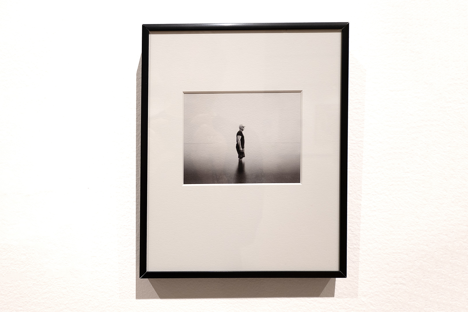
“Tabula Rasa, Durand Eastman Park, Lake Ontario” pinhole photo by Joseph Ziolkowski in 2025 Finger Lakes Exhibition
I rule out academic, cute and garish and I am drawn toward either expressive or distilled. Stopping me in my tracks is a good starting point and if I find myself looking at something for long time I call that a winner. I like Joe Ziolkowski’s pinhole photo.
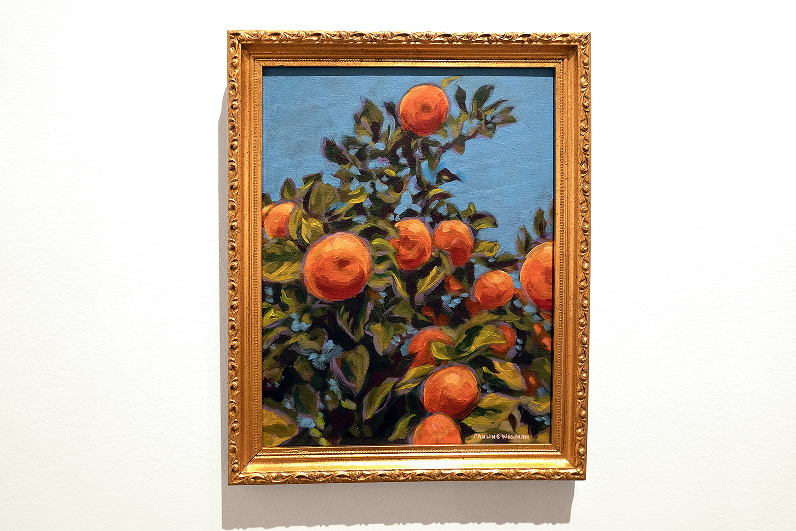
“Seville Oranges” acrylic painting by Pauline Wegman in 2025 Finger Lakes Exhibition
I could live with Pauline Wegman’s painting of Spanish oranges.
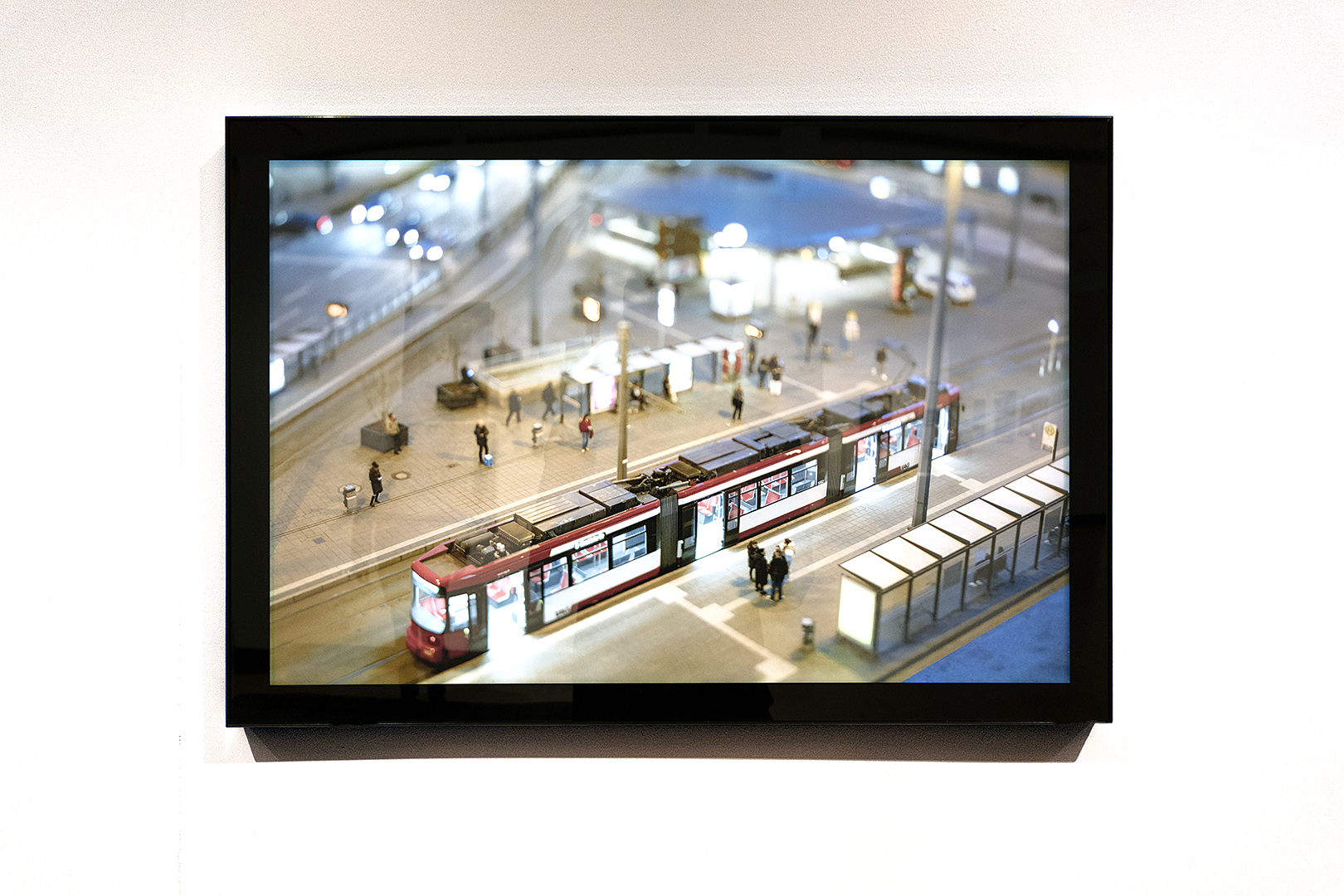
“Deutschland in Miniature” photograph by Francis Pellegrino in 2025 Finger Lakes Exhibition
Francis Pellegrino’s photo still has me puzzled. The glossy presentation looks like an image on a monitor or a Lightbox. I really couldn’t be sure that it was of a miniature. The sensation is like something a surveillance camera would catch. I’m not done with this one.
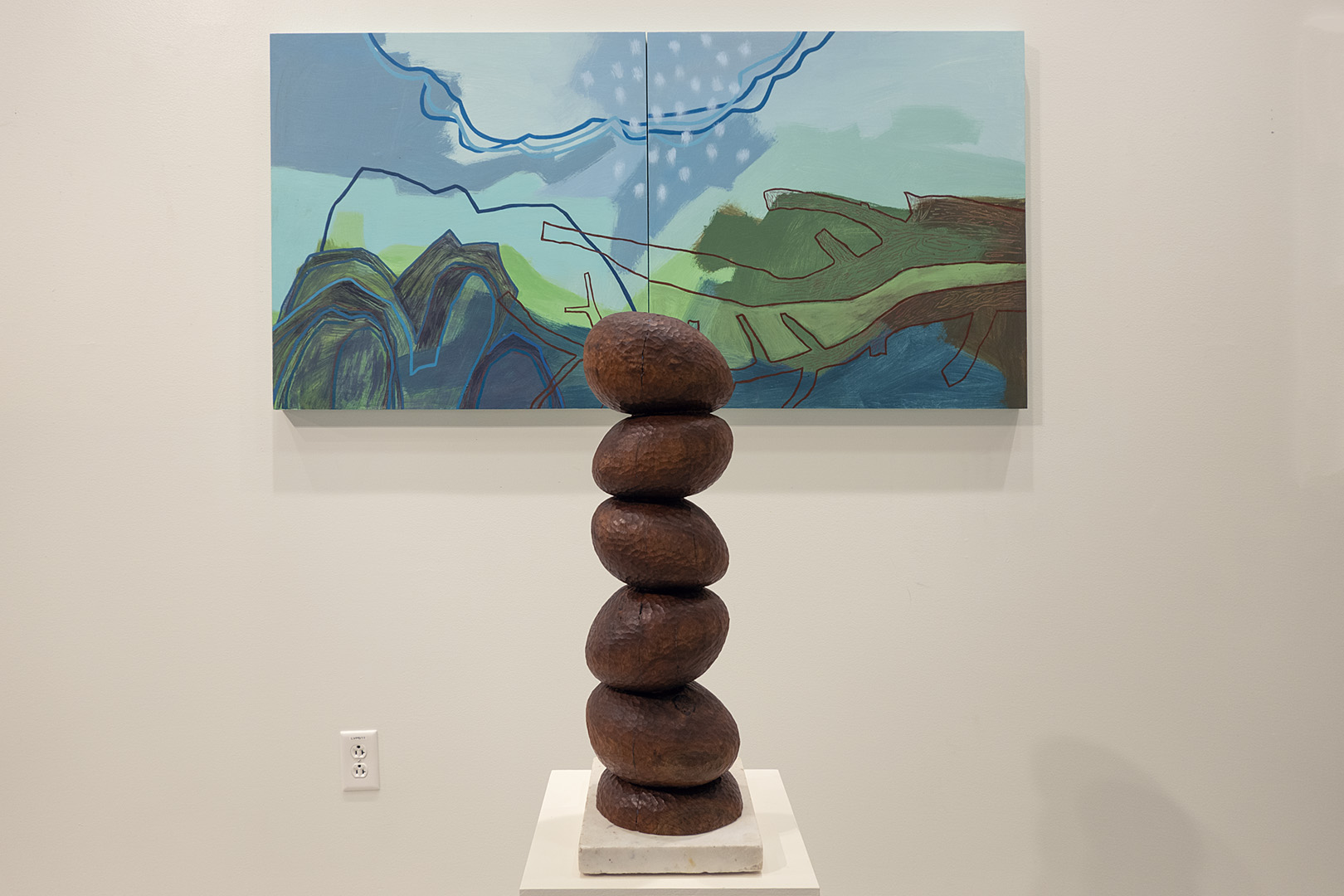
Judy Gohringer “Shoreline” diptych, acrylic on wood and Peter Gohringer “Totem” black walnut at Proximity Effect at RIT’s University Gallery
In the wall tags near these two pieces Judy Gohringer’s statement reads, “My challenge is the dance between depicting the recognizable in nature and conveying the essence of it in abstraction.” Her husband, Peter Gorhinger’s, statement reads, “Nature and abstraction have been constant sources of inspiration.” I love these two works and I love how they look together. They are my favorite pieces in “The Proximity Effect,” a group exhibition, at RIT’s University Gallery, up through July 25. The title is derived from the nearness of the artists’ studios in the Anderson Art Building.
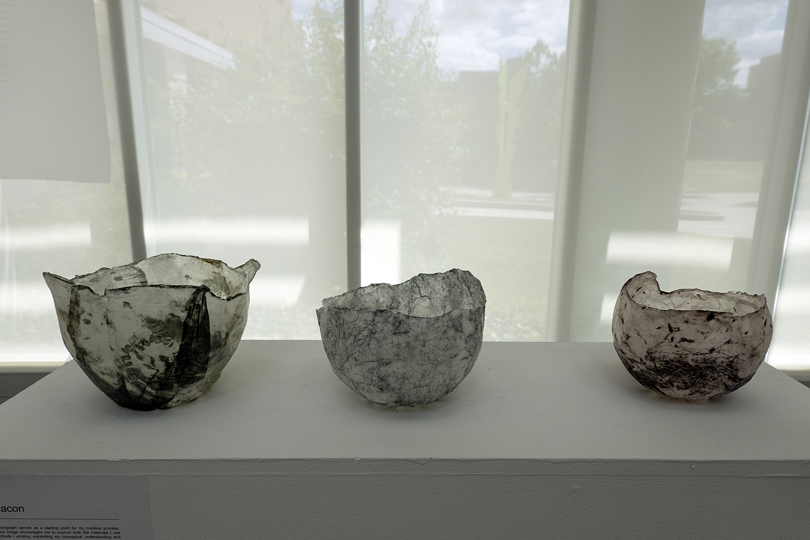
Pat Bacon Photogravure, Kozo at University Gallery at RIT
These bowls, on a pedestal in front of Colleen Buzzard’s beautiful hanging drawings, stopped us in our tracks. They look too delicate to touch but at the same time they look rough and ready. Paper thin, well, they are made of paper. Photogravure prints on Kozo paper but how did Pat Bacon, the artist shape them so perfectly. Peggi thinks a balloon may be involved. But how does the paper hold its form once the balloon has been popped?
Henri Matisse “Bas Relief” 1909 – 1930 in MoMA Sculpture Garden New York City
The sculpture garden on UCLA’s campus is one of the wonders of the world. I’m so happy Peggi’s sister took us over there when we were in LA. I posted a photo of these Matisse marvels while we were there and remarked how different the light made the sculptures look and feel. Now that I’m back home I called up the photo I took in New York to compare.
Henri Matisse “Bas Relief” 1909 – 1930 in UCLA Sculpture Garden in Los AngelesLeave a comment
One hundred years ago the downtown Los Angeles space now occupied by Hauser Wirth was home to the Globe Grain and Milling Company. Before I learned the history I was guessing it was once a convent or monastery. There is an open air herb and vegetable garden in a central courtyard and a restaurant next to it. Some of the galleries are large and light filled. Others, like the space where David Hammons’ ‘Concerto in Black and Blue’ is installed, are completely dark.
Someone on Hauser Wirth’s staff had the foresight to preserve the chunk of industrial history (“ruin porn”) in the photo above. The blue with black stripe section on the right is part of a Mary Heilmann installation. And they added the plant, of course, but to recognize the beauty in the crumbling and long neglected chunk of wall was a masterstroke.
Why are the galleries so spread out in Los Angeles? Why is everything so spread out here? You can’t miss with Hauser Wirth so we started there. Representing legends like Chillida, Guston, Louise Bourgeois and Eva Hesse and living artists like Henry Taylor, even their book stores are worth (wirth) fighting the traffic for. They have galleries all over the world now and each is an experience.
In LA there were three valet parking attendants manning a curbside stand in front of the former Globe Mill complex. We found street parking and went inside to the big, open air courtyard. Birds were singing above us as we chatted with the gardener while he trimmed an arugula patch. He told us they grow the greens for their restaurant, Manuela’s, which was just behind us.
British artist George Rouy was showing new work in the front gallery. His paintings remind me of a watery Francis Bacon, nowhere near as sculptural, but almost as intriguing. He clusters figures that appear engaged or entwined with one another but you can’t quite make out what they are up to. And their bodies are not fully shown.
In the rear galley space we found David Hammons’ installation, “Concerto in Black and Blue,” big empty, unlit rooms that we explored with tiny blue flashlights. It was a bit like the tunnel at a carnival. The shadows were interesting and there was just enough visual information to find the exits of each room. Maybe if there were more people and an dj inside (like the video) it would have been more engaging.
Their website says Manuela’s “is illuminated and animated by specially commissioned works from artists Paul McCarthy, Mark Bradford and Raymond Pettibon.” We missed those but found a mural by Mary Heilmann and we had lunch while sitting under a beautiful Henry Taylor painting. On the way out we asked if there were other galleries nearby and they told us the next few were about a mile away.
Christine Sun King “Hockney Future” at Whitney NYC
Christine Sun King’s graphic, deaf-centered work fills three floors at the Whitney. The large, graphic, charcoal drawings are bold but too similar to sustain their impact. I fell in love with this small one, labeled “Hockney Future.”
Low Rider Car in Chelsea gallery
I have seen cooler cars on the street in California but not in a Chelsea gallery.
Old door in Chelsea gallery
I have not seen a cooler door in a Chelsea gallery.
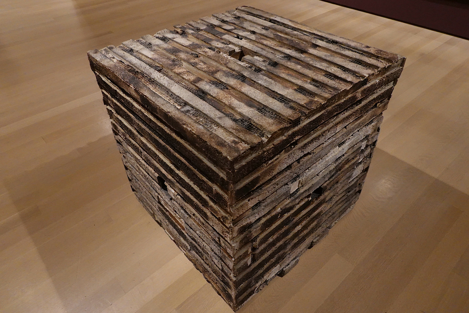
Jackie Winsor “Burnt Piece” in “Vital Signs: Artists and the Body” at MoMA
This great big cube was sitting out in the middle of the room at MoMA, part of “Vital Signs: Artists and the Body.” Before I knew it I was running my fingers along the boards , concrete and wire mesh. I was completely lost in the object, something that clearly had a history, when I heard the guard yelling, “No touching. No touching.” On the wall behind me, across from a Ana Mendieta performance video, a screen was playing, footage that captured the Canadian artist, Jackie Winsor, stuffing the piece with newspaper and surrounding it with wood before lighting it on fire.
Henri Matisse “The Back” MoMA sculpture garden
Gaston LaChaise’s “Floating Figure” used to sit on a pedestal in the Outdoor MoMA sculpture garden. I miss that but every time I visit Matisse’s ”The Back” the work gets better. Of course it is the same as it was 100 years ago but my appreciation of the form he constructed has only grown. It’s as if he decided to make it really difficult for himself. Figurative sculpture where the model has turned her back to him and flattened her form so he can show his mastery by pulling her form from the shallow slab of clay.
The nearby Whitney had free admission on Friday night so we stopped in after dinner and had another chance to see their Gaston LaChaise. It was only fitting that we finished our first night here devouring a HenryTaylor book in the hotel bar. The Meatpacking district is oh so arty now. “B Side,” the catalog from Taylor’s retrospective at MoCA LA was sitting on a shelf behind our table. Taylor is the reason we are in NewYork again, so soon after our last visit. We are here to pick up a print that was in his recent show at Hauser Wirth.
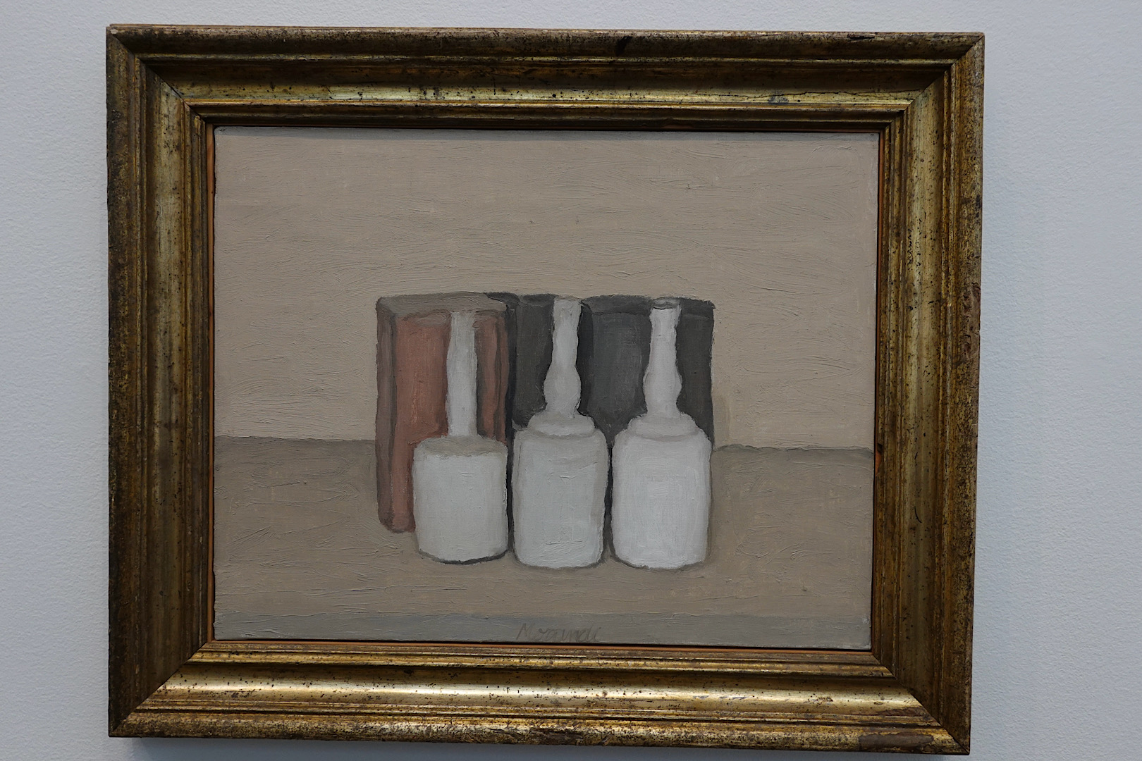
Saturday morning we had breakfast in a nearby diner and walked up the High Line to 18th Street where we began canvassing the galleries in Chelsea. We hit gold immediately with the Georgio Morandi show at Zwirner. It wasn’t that many years ago when we watched John Baldassari complete the purchase of a Morandi here. Morandi is a master. His landscapes, still-lifes and minimal abstractions are all luscious. We are not worthy.
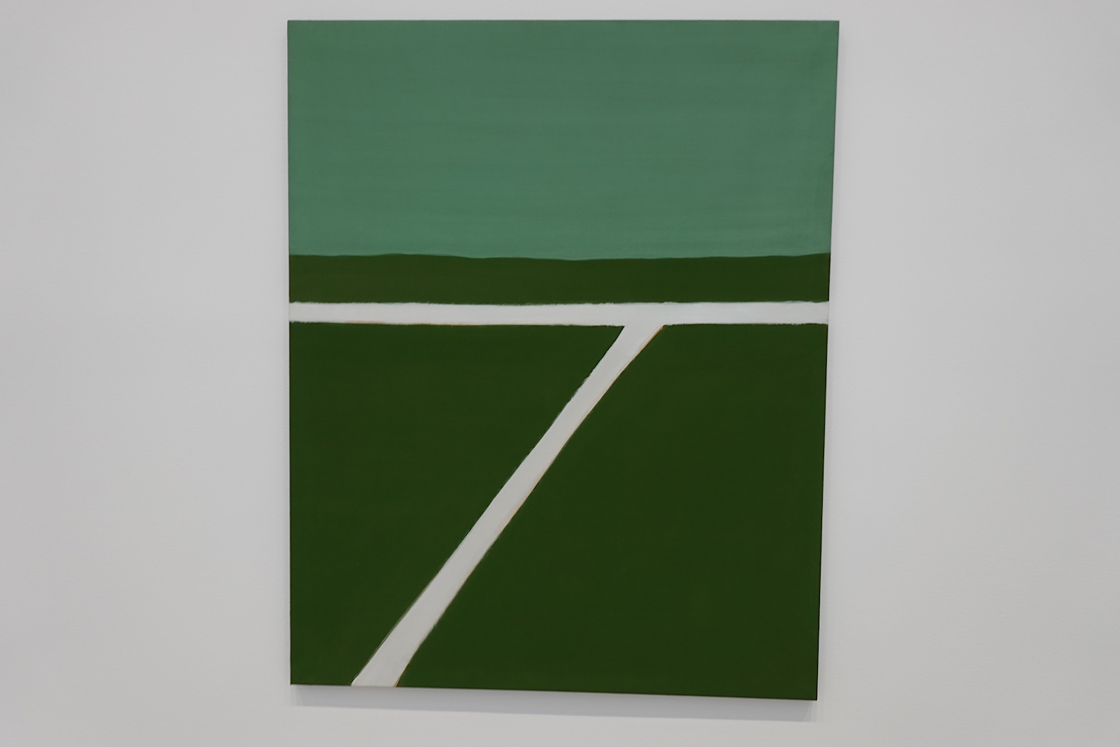
Raoul De Keyser painting at Pace Gallery in Chelsea
“A De Keyser painting deliciously halts the human impulse to make meaning.” That is from a NYT review of Raoul De Keyser’s show here and I can’t do any better than that. The abstract Belgian painter who loved soccer had us giddy at this show.
We stopped at an Italian place, Don Giovanni’s on 10 Ave. for a beer. It was so comfortable in there I’m making note of the place. The owner said he’s been here 30 years now. It is an oasis. We must have stopped in thirty galleries and found Irving Penn photos on 26th Street, another master. We saturated ourselves with art.
We had dinner at another Spanish place, Salinas, where vegan blood sausage was on the menu. We sat at the bar and enjoyed an arugula salad, endives with anchovies and baked cod with spinach. Back in our hotel we watched Atlético beat Valencia 3-0 on my iPad.


