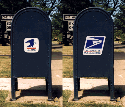
My sister-in-law teaches design classes at RIT. I recently sent her a birthday greeting and suggested she get her class to work on a new logo for the USPS. Sometime in the nineties the Post Office hired Young & Rubicam to design a logo to replace Raymond Loewy’s iconic 1970 design. We’ve been living with that abomination long enough!

We watched as the Post Office replaced the old logos on the boxes near our house in the city, and we couldn’t help but notice they skipped a few. We started rounding up photos of the old logo, and we posted them on therefrigerator.net. That website is long gone, but I had ChatGPT track down the page in the Internet Archive.

I found this tiny digital photo of mailboxes on Monroe Avenue, at what used to be called Brighton Commons, on a web page that led to the one above. I upscaled the photo in Photoshop and had AI generate the top and bottom portions. I’m really happy with how it came out. This AI thing has some potential. And I like the logos AI generated better than Young & Rubicam’s.
Leave a comment